Can UX designers work remotely? This day-in-the-life answers with a resounding yes.
Waking up to the sound of birds chirping on my balcony overlooking the stately avenue of La Rambla, I breathe in the warm winter air in Barcelona—my remote working destination for the month.
Even before the pandemic, the life of a remote UX designer sounded appealing to me, so I went on a two-year journey to live and work remotely for non-stop inspiration.
I worked on the beaches in Bali, explored the temples in Chiang Mai, took tram rides in Lisbon, and canoed around idyllic towns outside of Amsterdam.
While living large and crossing borders, I firmly got my answer to the question: Can UX designers work remotely?
Before 2020, remote work was the exception rather than the rule; most UXers had never worked remotely at all, but obviously, that’s all changed.
I went into UX design hearing a lot of voices advocating against working remotely. And while remote UX design does come with many challenges, it can certainly be done!
In fact, if you manage it well, it brings additional benefits to your workflows—such as uninterrupted focus time, and less communication addiction.
In this article I’ll walk you through a typical working day as a remote UX designer so that you can catch a glimpse of what to prepare for should you ever consider making the switch. I’ll even include some of my favorite tools along the way!
Can UX designers work remotely? Let’s see how it goes:
- 9am: Project planning
- 10am: Conduct discovery research
- 11am: Present research and define the solution
- 1pm: Lunch break!
- 4pm: Testing and iteration
- 6pm: Design is never done
If you’d like to see what a day in the life of a remote UX designer working from home in Berlin in 2022 is actually like, then this video will tell you all! In it, Maureen shares her typical workday, rituals, and habits:
9am: Project planning
My typical UX workflow starts, surprisingly, with writing. Writing is a great way to put things in perspective.
Documenting strategies and design goals will also come in handy later on when the team gets overwhelmed with the day-to-day and loses sight of the big picture. For this, I craft product plans, or product requirement documents (PRDs), with the team.
User experience design is a purpose-driven profession, and every UX designer should constantly ask the “why” as well as the “who” and “how”. It’s also the UX designer’s job to probe the product team about the value created for the end users.
With the business objectives in mind, I also use the Kano model or MosCow framework to prioritize “must have” and “nice to have” features in a matrix, so that the features are reasonably planned out in a roadmap. Folding Burrito created a useful article outlining a comprehensive list of techniques for prioritization.
After a few rounds of drafting, commenting, revising, and polishing, we are happy with the requirements and roadmap outlined in the plan and good to move on to the next stage: discovery research.
Tools: Google docs for writing project plans, Dropbox Paper for sharing and collaborating with the team, LucidChart for creating feature requirement diagrams.
10am: Conduct discovery research
While the PRD details the business vision and requirements, a user-centric design process is never complete without involving the end user.
The “aha!” moment comes from talking to real humans and investigating what they struggle with. As a UX designer, it’s time I wear my researcher hat to uncover design opportunities.
Among the myriad design research methods, I pick the best methods from the toolbox given the research objective and constraints. Design Research Techniques gives a comprehensive list of research methods at every stage of design, from discovery to evaluation.
Since discovery is heavily focused on exploring the problem space for potential solutions, I often employ a few primary research methods such as contextual inquiry, card sorting, and user interviews, along with a few secondary research methods such as heuristics analysis.
Doing primary user research remotely can be tricky, but there are tools and resources in place. I have used OptimalSort for remote card sorting.
It’s a great tool because the software generates a deep analysis of the results. I schedule user interviews using Calendly, and record my interviews on Skype. Google Forms is the handiest free tool for user surveys which I share online and in person.
Tools: Calendly for scheduling calls, Skype or Zoom for interviewing users remotely, Callnote for recording Skype calls, OptimalSort for remote card sorting, Google Forms for user surveys.
11am: Present research and define the solution

What’s more critical than conducting research is synthesizing research findings and defining the design solution.
This is the step where the UX designer bridges the gap between insights and execution. Many types of design artifacts can be used to present research findings, including user personas, empathy maps, journey maps, storyboards, etc.
The key is to put humans at the center of the problem through storytelling. As a remote UX designer, I find that storytelling is a very powerful way to align the team.
The tyranny of distance makes it hard for the remote UX designer to exert influence through in-person contact. But the power of storytelling transcends time and distance. Instead of persuading people over meetings, the UX designer can weave a narrative through imagery and a story that resonates with the team.
While storyboards can be created by quick sketches on paper, I often create more polished graphical artwork for journey maps in Sketch. I write user stories in simple text format, such as a Google doc. There are many templates for personas and empathy maps online. I make sure to share the artefacts with the team first and schedule a call to walk them through it all.
Tools: Pen and paper for storyboarding, Sketch for journey maps, Pencil for user flows. Google docs for writing user stories.
1pm: Lunch break!
Not having an office is both a pro and a con. I enjoy not being interrupted during focused work hours, but it can be lonely to go for lunch alone.
I use this chance to connect with fellow remote workers at my local coworking space, or go for a walk in the neighborhood to discover something new. I return to my desk feeling energised.
2pm: Designing the solution
Once the design solution is defined, it’s time I get to work on actualizing the solution in visual form.
Unlike other design professions such as graphic design, UX design is an iterative process that starts with rather “unpolished” deliverables.
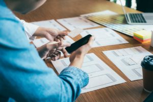
The first designs can be quick sketches on paper to quickly show possible design directions, or low-fidelity wireframes to focus team effort on content layout and interaction patterns first.
I’m big on quick ideation, especially when I work with agile teams. Along with the product owner, we prioritize one user story first, and quickly wireframe potential visual solutions for the entire user flow.
I like to offer a few variations on the same solution in the early ideation stage. Oftentimes, discussions about the best way forward take place between PO and designer, but sometimes core devs are involved to offer feedback on technical constraints.
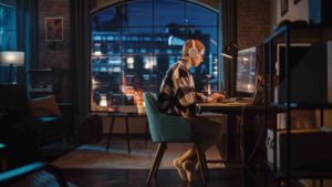
Once I nail down the layout, interaction and content with low-fi wireframes, it’s time to start designing in high resolution. This is when the designer puts their headphones on and gets in the zone. I prefer remote working for long stretches of uninterrupted design time, because isolation and concentration is what works best for producing high-quality visuals.
When working in an agile manner, it’s very important to constantly check in with the team on where the design is at. I try to join the product team’s daily standups, but even when I don’t have finished designs to show yet, I’ll report on what I’m working on so that the entire product team is in sync.
I hand off high-fi screen designs progressively, and iterate carefully based on team feedback. Keep in mind that the designs produced at this stage will likely change a lot after testing, so don’t be too precious about your designs.
When presenting low-fi or high-fi designs, it’s best to explain how the interactions would work either with screen annotations, or an interactive prototype.
Sketch recently rolled out a prototyping feature that allows you to link artboards and apply hotspots in a matter of seconds. I also enjoy using Marvel and InVision for quick prototyping, Anima App (sketch plugin) for publishing Sketch artboards as web pages, and Principle for prototyping a micro-interaction in high-fidelity.
Tools: Pen and paper for quick prototyping, Basalmiq for rapid wireframing, Marvel/InVision for interactive prototypes, Principle for animated micro-interaction, Slack for team chats, Appear.in for video calls.
4pm: Testing and iteration

Testing is one of my favourite parts of UX design. Seeing how real humans interact with my designs brings meaning to my work. After all, UX design is all about the users.
Usability testing is an unskippable step of the UX design process, because without usability, the usefulness and utility value of the product can’t unveil themselves.
Through usability testing, my goal as a UX designer is to gauge the usability of a product by observing: how easy it is to learn to use the product, how efficient it is for users to accomplish their goals, can users easily remember how to use the system, does the system help reduce and prevent errors, is the experience satisfactory, etc.
Because usability tests usually require the tester to observe participants and probe their actions in real-time, it’s best conducted in person. However, I have figured out ways to recruit and conduct usability tests remotely. Depending on the type of moderating techniques I choose, I always write out a plan to outline objectives, methods, participants, and tasks to be performed.
It’s very important to keep all test findings documented so that the UX designer can refer to test findings to identify usability issues. I have used Lookback for moderated remote tests where I can observe the users in real-time and solicit feedback as they work through tasks.
With documented findings from the tests, I’m able to identify obvious usability issues. Typical issues include failing to find items on a page, confusing layout/navigation, misleading button text, and so on. With the product team, we then prioritize the severity of usability issues, and I’ll iterate on the designs to fix them. If time and resources allow, it’s best to test the improved designs again.
Once the design iteration is production-ready, I use Zeplin to generate specifications for development handoff. It saves me time from manually creating design spec sheets on type, color, button styles, and so on.
Tools: Google docs for test planning, Calendly for scheduling tests, Quicktime for screen recording, Google sheets for logging findings, Lookback Live for remote moderated testing, Zeplin for handoff to your developers.
6pm: Design is never done
Continuously monitoring how users interact with the product and improving designs is an essential part of my job. Sometimes it also involves surveying users after a new design is released. The design-test-analyze-iterate process brings powerful results, and it’s never finished.
Being a UX designer today also means constantly staying up-to-date with new design patterns, tools and methodologies. I subscribe to a few design newsletters to stay current, actively contribute on designer forums and Medium channels, as well as teach myself new tools whenever I find the time.
Tools: Kissmetrics for collecting user behavioral data, Google analytics for analyzing app data, and Google forms for surveying users.
Closing thoughts
Working remotely as a UX designer can be every bit as collaborative and engaging as working in person, and that’s true whether you’ll use the freedom to travel the world or stay at home.
To read more about remote work in the post-Covid climate, check out our guide on how to become a remote UX designer. And here are more articles you might find useful:
