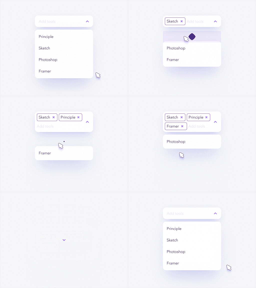
Unless you have UX writers on your team, or you’ve done some upskilling in UX writing yourself, microcopy is one key element of of your design process that is probably being overlooked.
But what exactly is it? And do you make sure that yours isn’t creating pain points for your users or, worse, causing them to drop out of the user journey.
In this guide, we’ll define what microcopy is (as well as UX writing) and give you some best practices that will help you write the most helpful and impactful copy for the products you design. Here’s what we’ll cover:
- What is microcopy?
- What is UX writing?
- Three traits of the best microcopy
- Five tips to write amazing microcopy
- Final thoughts
Before we dive in, here’s a video introduction to UX writing (recording of an event with a UX writing challenge!)
1. What is microcopy?
Microcopy refers to the tiny bits of copy on products. From the label on a call to action button, to the placeholder text in input fields in forms, we use it everywhere on our interfaces. Tiny tidbits of copy, big impact on our experience.
Even though these little clusters of text don’t occupy extensive amounts of space on our products, collectively they are a driving force and make a huge difference—responsible for shaping a generous portion of the user experience.
Microcopy can help us guide users, engage users, cue users into functionality, and create pleasurable experiences. Think of it as a little voice leading and aiding users in their journey.
Consider the changing label on the button below by Nicolás J. Engler. After a user clicks on it, the label changes from “submit” to “sending.” This small yet thoughtful change lets the user know the system is working in the background to process whatever the user submitted. Once the process is complete, the label changes again from “sending” to “done.” A fantastic example of how microcopy can inform, delight, and guide the user.

2. What is UX writing?
UX writing is the process of creating user-focused copy that helps get users from point A to point Z in the user journey, one step at a time. By applying the UX design process to the words that appear within the user experience, UX writers find effective ways to:
- Meet user needs and resolve existing painpoints
- Anticipate users’ needs and questions
- Establish a conversation with users
- Build rapport and trust between the user and the product/brand
- Postively impact the overall UX, creating a more inclusive experience for all users
It’s important to note that UX and copywriting are two different things and, more and more, are two separate roles in the tech sphere. If you want to learn more about the field of UX writing, here are a few articles you’ll find helpful:
- Here’s How to Become a UX Writer in 2022
- The Ultimate Guide to Inclusive UX Writing
- The Best UX Writing Courses (and How to Pick One)
3. Three traits of the best microcopy
Not all microcopy is created equal and you will find some painful examples out there. Good microcopy is compact, aware, charming(ly effective). Let’s look at each characteristic in a bit more detail.
Compact
The point of this copy is to help users get from one stage in the experience to the next as smoothly as possible (building rapport along the way—as appropriate). Good microcopy isn’t wordy, it isn’t lengthy, and it doesn’t ramble. It is clean, simple, and goes straight to the point.
Aware
Awareness of users’ needs and goals is absolutely key, as is a focus on the user journey—where’s the user at in the journey at this particular point? Where were they right before this? Where will they go from here? Good microcopy is mindful of the product and user goals, and understands its purpose in helping to accomplish those goals.
Charming(ly effective)
Concision and goal-awareness does not have to equal boring. Good microcopy should be conversational and charming, in an on-brand, getting-the-user-where-they-need-to-go sort of way. It should be delightful and clever, making the experience all the more pleasurable and engaging. But a word of warning: It’s easy to get carried away! Don’t mistake charm for effectiveness, especially in parts of the user journey that require more care (when the user might be feeling less assurance, and more fear or wariness).
4. Five tips to write amazing microcopy

Although it can be intimidating, especially for anyone without a lot of writing experience, writing for a digital product doesn’t have to be stressful! Here are five tips on how to get your microcopy to be compact, aware, and charming.
Tip #1: Define voice and tone
If your company/product already has voice and tone guidelines established, you have a head start with this—just make sure that what you write meets those standards. If you don’t already have voice and tone guidelines, you’ll need to establish them. Don’t worry! It doesn’t have to be a terribly complex process. But before you begin to think about all the little nooks you’ll tuck your clever microcopy into, you’ll want to define a voice for it.
And how do you define a voice?
Here’s a simple 3-step process (use this to start and then refine and iterate from there):
- Imagine your brand or product is an actual person. How would they speak to your users? What would their voice sound like? What’s their personality and relationship to your users?
- Pick three attributes/adjectives to define the product’s voice. Example: smart, friendly, to-the-point.
- Use these three descriptors as a guideline as you write for the product experience.
Tip #2: Keep it casual
Long gone are the days of rigid and cold products. These days, apps and websites don’t sound formal or serious—they are friendly and relaxed. Your microcopy plays a huge role in communicating this feeling, especially during portions of the experience that can make users uneasy, like error messages. Try to remain conversational in your writing—open, and inviting.

One of my favorite examples of microcopy popping up everywhere are suggestions in search fields. Rather than using the classic “search” label in them, products are opting for creative suggestions.
In the shot above, Airbnb suggests a location, Costa Dorada. The word choices feel relaxed—they opt for a simple and friendly “try.” This string of words quickly tells the user what to do with the UI element and who knows, might lead someone straight to a new, exciting location.
Tip #3: Keep it clear
Good microcopy speaks your user’s language. Try to use everyday, simple words users will be familiar with. Talk to your users, get to know how they speak, learn their jargon, and model your writing on them.
Namika Hamasaki keeps the labels on the two buttons in her pop-up straightforward and simple. The labels are fashioned using everyday language, easy for anyone to understand.

Tip #4: Be helpful
Remember, good microcopy helps guide users. Whenever you jot down a sentence or label a CTA, make sure it is helping users get somewhere and not creating a dead end inside your product.
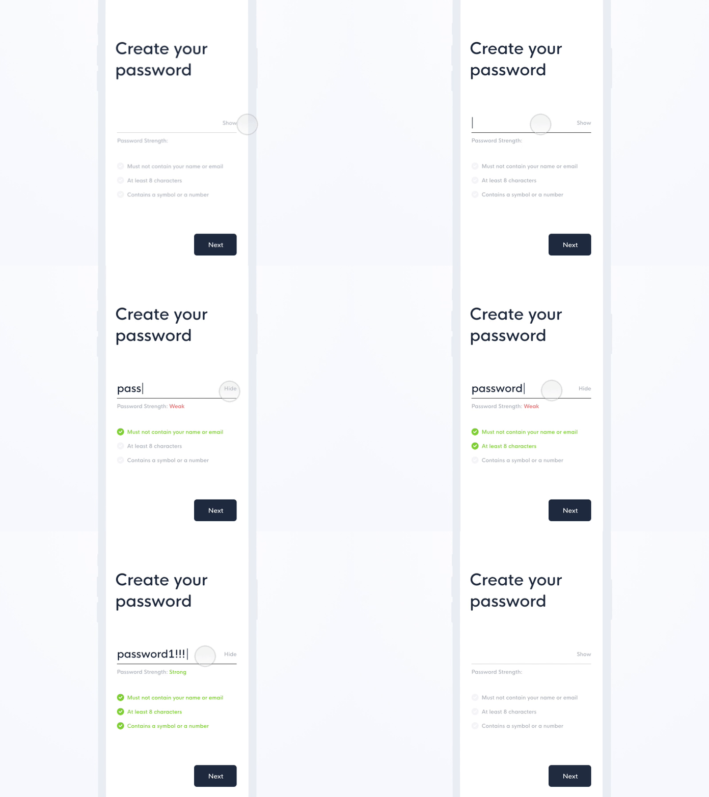
Emmanuel Torres makes it super easy for users to create strong passwords. He sets a strength meter right below the password input field that lets the user know how effective the password it. Below, he lists out the three main characteristics strong passwords on the product should have. These small words make password selection a piece of cake.

Tip #5: Test your copy!
As with all things UX, you need to test your microscopy with actual users. This will help you measure its clarity and make sure it resonates with your audience. Just because a set of copy works well and makes sense to you and your team does not mean it will work for all of your users! Test, test, test—then iterate and test some more!
If you want to write microcopy that works well for all kinds of users in a variety of situations, you’ll want to make sure you’re writing inclusively and conducting inclusive UX research to begin with.
5. Final thoughts
Whether you’re a new or aspiring UX writer, or you work elsewhere in the design and development process, if you have a part in creating the words to guide your users, microcopy is an essential skill to master.
This guide, as well as the resources we’ve linked throughout, should help you get on your way to writing concise, aware, and charming(ly effective) microcopy. If you want to learn even more, here are a few other articles you’ll find helpful:
- 11 outstanding books for UX writers
- How to up your UX writing game
- 5 Tips to create a stand-out UX writing portfolio
- Top Current UX Design Trends to Follow
Happy micro-writing!
