If you want to get started in UX design, you are 100% guaranteed to need an amazing UX design portfolio in order to land that first role.
And even if you’ve already got experience in the field, it’s important to keep your portfolio polished and up-to-date.
As a UX recruiter, my role involves not just identifying and developing tech talent, but also following the industry closely; going to events, workshops, and conferences to make sure I’m in a strong position to connect the dots and successfully match companies with perfect-fit employees.
Through the conversations I have day-to-day, I’ve managed to put together a clear picture of the industry as it stands and what the expectations are for all levels of UX designer, from absolute beginners to senior UXers and UX directors.
One big aspect of my role is making sure that the candidates I work with are amazing at showcasing their skills, experience, and past achievements. One thing I get asked over and over again is, “Where should I begin with creating my portfolio? What’s the standard? How can I make it better?”
So, I’m going to share the advice that I frequently give out to candidates I work with, be it a beginner, mid-level or senior UX designer. I’ll be explaining why your portfolio is so important, what to include, where to host it, how much to include, and answering lots of other common questions. Select any of the topics from the list below to jump straight to it.
- Is a UX design portfolio really necessary?
- What is the purpose of your UX portfolio?
- What should you put in your UX portfolio?
- Top tips for your UX portfolio
- Should UX researchers also create a portfolio?
- Should you use video in your UX portfolio?
- How many projects should you showcase in your UX portfolio?
- How should you test your UX portfolio?
- How do you deal with NDAs when building a UX portfolio?
- Can you build a portfolio with no experience in UX design?
- Where should you host your UX design portfolio?
- Where can you find UX design portfolio inspiration?
- Conclusion
- FAQ about how to make a UX design portfolio
If you’re more of an audiovisual learner, check out the following video. UX designer Dee Scarano walks through her top tips for creating a winning UX design portfolio.
1. Is a UX design portfolio really necessary?
Let’s put it this way; in an industry where education and previous experience is not strictly a prerequisite to landing your dream role, a UX design portfolio is arguably even more important than your CV. It acts as a meet and greet before the hiring manager actually gets to meet you.
Times have changed, and the number of UX vacancies is increasing year on year, but with that, there are more UX designers in the market. So, you need to differentiate yourself somehow, and for that you can’t just rely on your CV.
Compared to 10 years ago, many companies know intricate characteristics they are looking for in a new hire, so it’s vital you show them you meet their needs. If you don’t I can assure you someone else will. It can mean the difference between instant rejection or getting called to come in for an interview.
As well as core UX roles, there are a number of hybrid roles which require more than just UX skills so this is the perfect opportunity to showcase that you’ve worked on different parts of a project, e.g. UI design, strategic decision-making, or overseeing the web development.
Your portfolio is also an opportunity to showcase some of your personality. In an age where there is more emphasis on hiring people who match the culture of the business, a portfolio is a perfect opportunity to show that you’re a cultural fit. It’s much harder to get your personality across on a CV given that approximately 99% of CVs follow the same format.
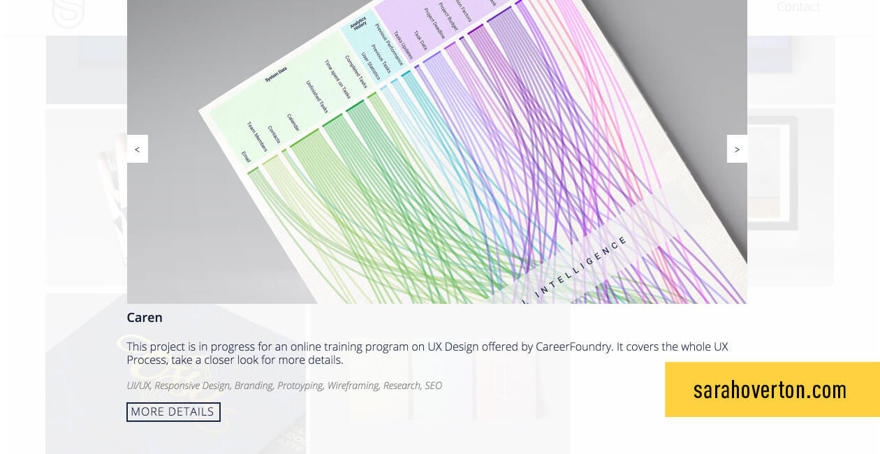
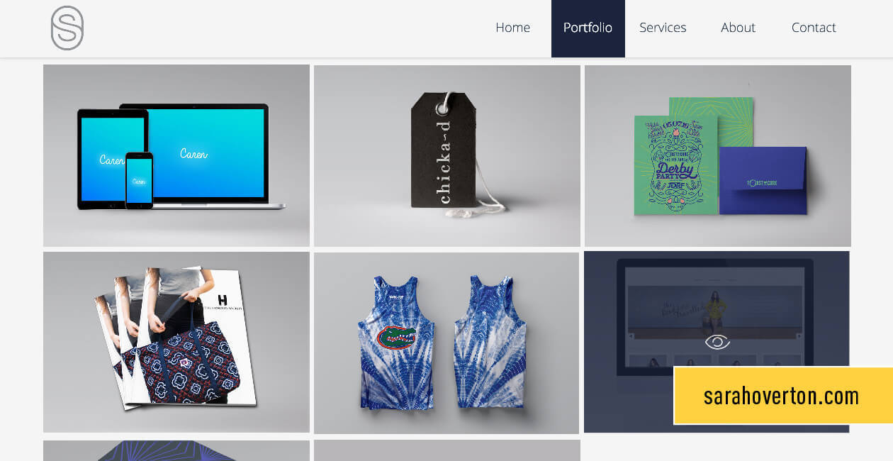 CareerFoundry graduate Sarah Overton’s portfolio.
2. What is the purpose of your UX portfolio?
Here is my take on it. A good portfolio indicates, in short, that this person has taken time to represent themselves in the best possible light, and they’re clued up enough to showcase their most relevant work in an aesthetic and logical way.
It should define who you are, what you can do, and what part of UX you specialize in. Remember: don’t rely on your CV for this. According to statistics, recruiters only spend 6 seconds looking at your CV.
They will scan four key areas: your name, current position, previous position, and education. In a nutshell, your CV is boring. Your portfolio need not be.
Your portfolio should show cultural suitability for the company where you are applying. Don’t be afraid to add a touch of character or your own style to your portfolio. It’s your chance to wow the hiring manager and demonstrate that you stand out from the crowd.
3. What should you put in your UX portfolio?
Your portfolio content will vary.
This depends on your seniority (scroll down for specific tips on beginner vs senior portfolios), the companies you want to work for, the country you live in (as different countries have different market expectations), and of course, whose advice you listen to! These will all play a massive part in what you produce.
The single most important thing you can do to make sure your UX portfolio grabs attention, regardless of your level, is this: show process.
Show you can do the graft and hard work that comes before the pretty pictures.
For example, check out the way that UX designer and CareerFoundry graduate Michelle Lock shows her work in her Fitted app case study. Rather than just showing us the polished designs, she includes information and pictures of user flows, sketches and wireframes, moodboards, and the product style guide.
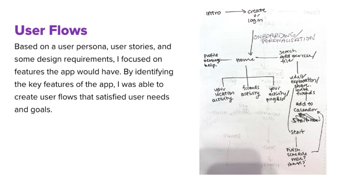
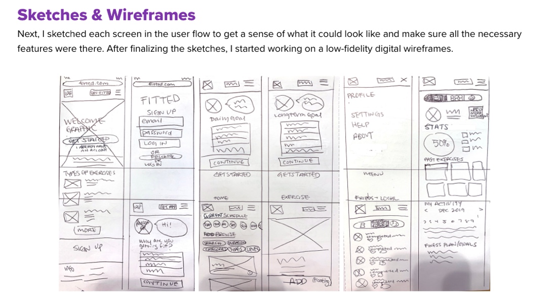
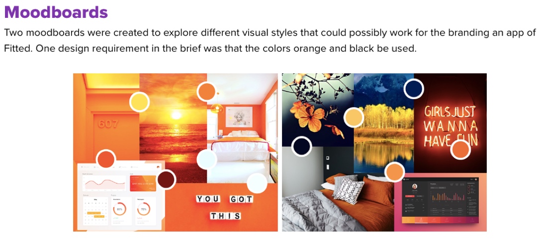
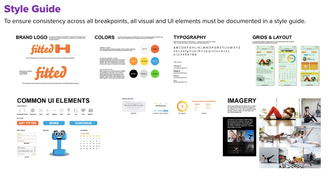
As you can see from just this one example, a strong UX portfolio shows your process. In addition, it’s important to give context for each project you feature. For each project in a UX portfolio, I expect to see:
- The problem
- Who you worked with
- What tools you used
- Discovery phases (how did you go about solving the problem)
- The process you used to overcome the problem: lo-hi wireframes, prototypes, sketches, personas, user journeys, and research
- The final outcome (both of your work, and what happened after it was handed over, e.g. to a UI designer or developer!)
If someone walked in off the street, with no background in UX, your process should make sense to them—just like your high school chemistry notes would.
I also like to see storytelling—a plot development in the UX portfolio. In between each part of your process, explain why you went onto the next step of the process—did you run out of time? Did you feel your data was statistically significant? This will help the hiring manager get inside your mind and understand how you approach problems.
If you didn’t create any UI solutions, I recommend that you still show the final outcome in your portfolio but make it clear that it wasn’t your work. In my experience, companies like to see how your work translated into the final solution.
This is especially true if the company hiring isn’t very UX mature. They might not be able to imagine how UX translates into an end product. As we all know you don’t look on a website and say “My, look at that UX!!” but you do say “Oh look, beautiful graphics!”
Showing how UX translates into products can help you educate companies around the importance of having a UX designer and not just a user-centered UI designer.
If you are going for a hybrid role, you don’t want your portfolio to be just pixel-perfect and overly visual, as this will be less relevant compared to other candidates who have submitted a more rounded portfolio inclusive of user-centered design (UCD) methodologies and practice.
However, if your biggest talent lies in visuals and that’s where your passion is, perhaps you should stick with that rather than diluting yourself as a part-time UXer, hosting reluctant user interviews and creating personas.
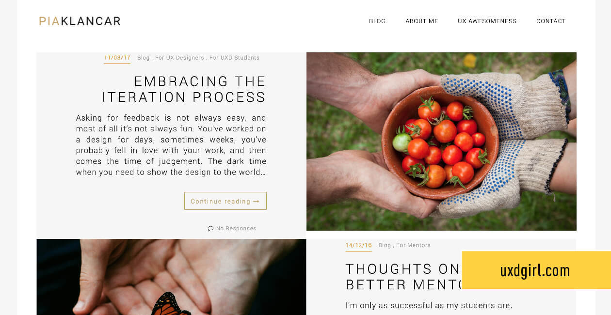 Senior UX Design Mentor Pia Klancar’s personal website.
Now I want to quickly break down some differences in portfolios for junior and senior UX designers.
4. Top tips for your UX portfolio
UX portfolio tips for beginners and juniors
As a new UX designer, it’s only natural that you won’t have vast quantities of work to show in your portfolio, so instead you need to find a unique angle to stand out. Personally, when I look through junior portfolios I like to see some personality in there, even if there are only a handful of projects.
Ways to inject personality include adding any personal projects you have attempted, and talking the reader through how you went from an idea to a finished solution. Even if it was a complete failure or it was part of your UX design course rather than a paid gig, show it!
For me, failing but being humble around the fact you know that you can improve shows determination, grit, and motivation. From multiple conversations with hiring managers that I’ve had on the topic of junior UX portfolios, I can tell you that they’re not expecting examples of perfect process-driven work, they want to see personality and if you’ll be a good fit culturally. The rest you can learn on the job!
UX portfolio tips for seniors and managers
These can vary depending on what type of work you’ve been doing, either hands-on or hands-off. If you’ve been in a managerial hands-off role, I personally don’t think there is any point in you sharing work from years ago when you were more hands-on.
I think a much better option is to show examples of your team’s work on different projects. Show examples of how you set the strategy, delegated the tasks, mention whether you had to do some hands-on work or not, and the final outcomes of projects. Did you achieve great ROI for the client or better user experience for customers? Show some data to back this up.
If you’ve mentored a junior UX practitioner, show examples of their work before you mentored them and their work currently. This is a great indication to your future employer that you can make a deep impact within an organization and team.
Presentation tips for your UX portfolio
Even if you are not interested in UI or graphic design, I am firm believer a visually-pleasing portfolio is important! It’s just good sense.
Pay attention to color palette and fonts—create and follow your own personal mini style guide, i.e make sure that page 3 matches with page 10. It could be the detail that gets people admiring and sharing your work, resulting in deeper exposure in the UX market. Remember, people are visual animals.
For example, if you were to go onto a travel website and the UX was great, but the visual elements were really inconsistent and boring, you’d probably leave the site. Don’t let this happen to your portfolio site.
Making it visually pleasing will show the hiring manager that you pay attention to small detail. No harm can be done from making your portfolio look nice.
Make sure to annotate your portfolio, but don’t make it too text heavy as this will bore the reader and disengage them.
Another way to boost engagement is my next tip, and something I have been experimenting with lately!
5. Should UX researchers also create a portfolio?
I’ve been asked this quite a lot. If your area of expertise is user research, you might struggle to create a portfolio of polished visual designs. Does that mean you don’t need to create a portfolio?
Previously, I wasn’t 100% sure on this, but now my answer is that you definitely should create a portfolio!
As we know first impressions are what matter in a hiring situation, and that’s probably why so many researchers try to build their portfolios with examples of UI but this is the wrong way to do it.
If you’re a UX researcher, you don’t design screens, so don’t worry about putting them in your portfolio. Show the impact you had on a project!
While the project may not follow the exact same pattern, there are still key things a hiring manager wants to see. For example;
- Who the client is
- The problem you were brought in to work on
- Your approach
- The results (in a clear format)
- What this meant for the rest of the project
And even if you’re a researcher and visuals aren’t your strong point, please don’t make this fact blatantly obvious with terrible design! Here’s a helpful, in-depth guide to creating a portfolio as a UX researcher.
6. Should you use video in your UX portfolio?
Recently, I started interviewing UX practitioners in the industry on camera about interesting topics. It’s a great way to get information across in an engaging way. So how can you use this in your portfolio?
There are lots of possibilities. You could show a video of yourself interacting with users during user testing, or show yourself or a user happily demonstrating the end product. Another way could be for you to have a short 10 to 20 second video of you introducing your website and your working style.
There is something very engaging about video, and let’s face it—you need to do all you can to make the viewer engaged! Give them a reason to stay around and view your work.
The great thing is that nowadays almost everyone has a decent video recorder on their phone, so whenever you’re working on something interesting you should try and make a short video just in case. You can even edit clips into a video montage.
7. How many projects should you showcase in your UX portfolio?
I would advise showing a maximum of three examples in your UX portfolio. If you’re a junior, even one or two projects is enough. Choose projects which you’ve had the most impact on, and show work which is clearly laid out.
If you’re reading this and have a few years’ experience, you’re probably thinking, “but I have so much work to show.” You need to think of a portfolio as a selling tool, it’s to sell your services to a certain company. If you just show everything, rather than curating your hottest work, it could disadvantage you.
You have to think of a portfolio as you dangling the carrot waiting for the hiring manager to take a bite. Once you have an interview, you can mention other projects you’ve worked on.
If you’re passive in the market and only want to specialize in one sector or would like to work in one particular sector, it would be a good idea to show a project that you’ve worked on in that sector.
If by chance the project you worked on in the specific sector wasn’t your best or most-detailed, still include it as it shows you have an interest in this area and some experience. As UX has grown, so has the number of candidates meaning companies have more pick. That’s why you might see on job specs, e.g. “must have experience in financial services.”
f you haven’t worked on a sector that you’re targeting, try including some personal projects in that area or write a killer cover letter—something you can read more about in our guide to writing a UX cover letter.
8. How should you test your UX portfolio?
Hiring managers usually have a very limited time to look through portfolios. You should have a portfolio that allows a manager to look through your work in 30 to 60 seconds and know what projects you’ve worked on, get inside your mind, and know how you solve problems.
That’s why I always recommend trying some simple user testing techniques. Get some volunteers, these can be a partner, friends or family, and get them to look at your portfolio and complete small tasks or hunt for crucial information. Then you can define and tweak the content to get to the desired goal.
Having the right information readily available shows your potential employer that you’ll be capable when it comes to presenting to stakeholders, as well as working on information architecture if it’s part of your job!
Some of my best tips to get your portfolio concise and to the point:
- Structure your portfolio clearly, with clear navigation to the projects, sub-headings, and a clearly defined process.
- Get rid of anything in the portfolio which doesn’t represent your best work. Have one example for each part of the process.
- Include a clear overview so people know exactly what the project was about, without having to read through the whole project to find out.
- Cover different bases. For example team leaders, specialist recruiters, project managers, and internal recruiters all have their own agendas and different checklists. A UX team lead may be looking for process, whereas an internal recruiter will want to see how much experience you have. Tailor your portfolio for all audiences.
Tip: When you test your portfolio, test it on different people and give them different goals, e.g. estimate how many years of experience I have or find a statistic that proves the ROI of my project.
9. How do you deal with NDAs when building a UX portfolio?
Firstly I’d like to say the following are only suggestions and I would always advise asking the client first. But, put yourself in the shoes of your potential employer. Would you really hire someone without any evidence of their skills, process, and experience? There’s a risk even for referred or recommended candidates because these can be biased, so having evidence of your work is key.
The first option could be to anonymize all the data from the project but come up with what the problem was, your process, and final outcomes. Here, make the text generic—but specific enough for the hiring manager to get an understanding of what you do.
My advice to graduates and junior UX designers coming onto the market is to take a role in which you can guarantee that you’ll be able to show the work you produce because without any work to show, finding a role afterwards can be tricky. You have to take your first role in UX with your next role in mind, so having work to show can be the stepping stone to greater things.
10. Can you build a portfolio with no experience in UX design?
As a recruiter I have the privilege to help people switch to UX from other careers. They typically want to know how they can get a portfolio which will stand up in an interview. I won’t lie—this can be difficult with a lack of commercial UX experience.
However, it is possible to demonstrate skills and attributes which are important for any UX practitioner. For example research and the methodology used to get to a solution: testing, initial drafts, wireframes, personas, prototypes, evaluations etc. Here are some ways you can start to build a portfolio if you have no background in UX:
1) Take a course: Taking a UX course is a great way to build up your portfolio because you will learn key UX principles and put these into practice. Find out how to pick a program here: What to look for in a UX design certification.
2) Volunteer: Volunteering for a charity/non-profit is another awesome way to build experience and help shape a portfolio because not only are you working on a live project, but will get exposure to real users. This shows amazing initiative and can help to show a good team spirit.
3) Hackathons: Hackathons are really inspiring—and not just for coders! A hackathon is usually a one- or two-daylong competition where software programmers, developers, UX designers, UI designers, etc. come together to design something. These can help you build a portfolio in a short space of time, as well as learning from inspirational people and growing your network.
11. Where should you host your UX design portfolio?
My top tip is always to create a personal website, even if you have to pay a small annual fee. Trust me, it’s a wise investment and will pay for itself.
Websites win for me because they are easier to remember (if you have a catchy domain name—such as yourname.com), people can drop it into conversations, and you don’t need to keep sending over PDF files, saving time which can be all the difference if you’re looking for contract work.
Websites can also show more than just your work, with an about me page, blogs, videos etc. As I’ve said a few times now—showing personality is crucial in an interview process especially if you’re junior with not a lot of work to show.
Websites are fantastic to create a brand. Whoever you work for, you are a brand. You’re a self brand. You are such-and-such at a certain company. Having a website is an opportunity for you to improve your profile within the UX community. If you’re good with SEO, it can even help people to find you.
On the other hand, one of the benefits of having a PDF is that you can constantly tailor what you send over. My advice in that case would be to have a website of your best 2 to 3 projects and build an additional customized PDF if you’re targeting a certain sector/company.
Other websites which are useful are Behance and Dribbble, but personally I actually, maybe controversially, don’t recommend worrying too much about them.
Here are 9 of the best free websites for your UX/UI portfolio. This should give you a good starting point.
12. Where can you find UX design portfolio inspiration?
If you’re looking for some portfolio inspiration, I recommend you take a look at this breakdown of the very best UX design portfolios currently out there. You might also like to see the kind of portfolios that CareerFoundry UX design graduates produce—and in the video below you can watch a senior UX designer’s review of a recent graduate’s portfolio. Our friends over at UX Collective have also put together an extensive list of innovative UX design portfolios that’s worth browsing.
13. Conclusion
Ultimately, the number one way to advance your career in UX is to have a killer UX portfolio where you present yourself in the best possible light. Even senior designers need to prove what they can do. There should be no excuses to not having a portfolio, so on that note: go and create something amazing!
Further exploration
- How and when to ask for a raise (salary negotiation for designers)
- How to build amazing case studies for your UX design portfolio
- How to create a UX writing portfolio
- How to turn your passion into a design project—webinar recording
14. Frequently asked questions (FAQ) on how to make a UX design portfolio
1. How do I create a UX portfolio?
Creating a UX portfolio involves showcasing your best work through carefully selected projects with comprehensive case studies. Provide context and storytelling, organize your portfolio intuitively, focus on visual presentation, highlight your process and skills, and include results and impact to make your portfolio compelling and informative.
2. How do I start a UX portfolio for beginners?
Beginners can start a UX portfolio by working on personal projects or volunteering. Treat these projects as real-world scenarios and create case studies that explain the problem, approach, and solutions. Seek feedback from mentors and peers, iterate based on suggestions, and continuously improve your portfolio as you gain practical experience and refine your design skills.
3. What goes in a UX design portfolio?
A UX design portfolio should include project case studies that demonstrate your design process, problem-solving abilities, and outcomes. It should showcase visual examples such as screenshots or videos to highlight your visual design skills. Design artifacts like personas, user journey maps, and information architecture diagrams can provide insights into your understanding of user-centered design.
Additionally, mention your skills and tools relevant to UX design and include an about section with contact information to give viewers a sense of your background and expertise.
4. Where can I make a UX design portfolio?
There are various platforms where you can create a UX design portfolio. Popular options include website builders like WordPress, Wix, or Squarespace, which provide customizable templates and hosting services.
You can also use dedicated portfolio platforms like Behance, Dribbble, or UXfolio, which are specifically tailored for showcasing design work. Choose a platform that aligns with your needs in terms of design flexibility, ease of use, and the ability to showcase your portfolio effectively.
