You know that moment when you’re chatting about something you are totally passionate about (let’s assume if you are reading this, your answer might be… apps) and someone turns to you and asks straight out: “So, as you know so much about this, which one is your favourite?”
And there and then, your mind chooses to go completely blank…
Me too. As a UX designer, I get asked what my favourite app is all the time, and up until recently, I assumed the expectation is that a designer should launch into an exquisite monologue about color schemes, cute animations and advanced features that let you text your fridge or something…
But that conversation invariably leads us down a path of talking about singular screens, gradients and even button animations — and while it’s fun to nerd out on pixels, are we not selling our craft of UX design short? And in an age of chatbots, voice and augmented reality, is speaking in terms of “apps” even still relevant?
This summer, Apple’s app store turns 10 years old, but has reached critical mass with growth slowing from 58% in 2015 to just 6% in 2017. Unsurprisingly, established companies like Facebook, Spotify, Instagram and Google maps still hold the title of “most downloaded” and, as a result, it’s increasingly difficult for newcomers to break in.
But it’s not just a fight for attention on the App Store anymore; the world is catching up and is becoming increasingly wary of the tech world’s abusive freemium models, wayward ways with privacy clauses and incessant “disruption”. And anyway, when was the last time you got excited rather than annoyed at having to download an app to achieve what you wanted?
So maybe it’s time for us designers to use this question as an opportunity to reframe a higher purpose for UX design, as well as to invite our interlocutor to question how they think about the digital products they use. Below are a few examples of how I use the topic of “apps” as a jumping-off point to dive deeper into the “why” of a product rather than the “what”.
My favourite app is the one that is a fair value exchange.
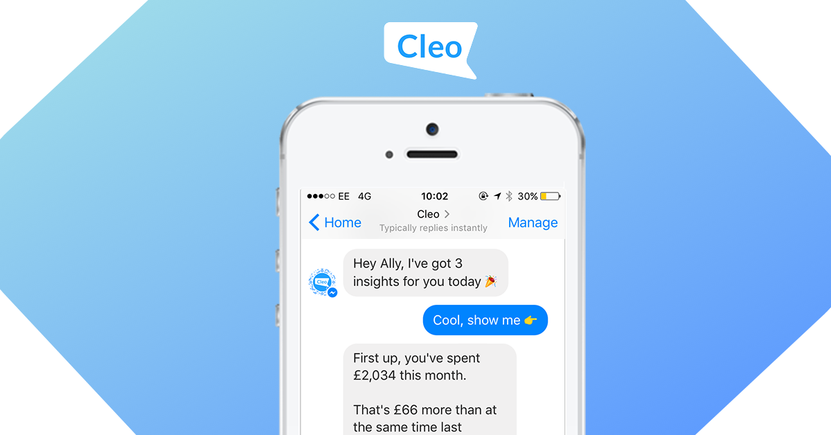
To manage my spending I currently use Cleo, an AI-powered chatbot that securely scans my bank transaction data. By analysing my spending (in a read-only mode), Cleo helps me track categories and surface trends about where my money is going. Using a conversational interface, I can ask “how much did I spend on eating out last month?” and Cleo will deliver the painful news via text message or messenger — often accompanied by a sassy gif. (You can fine-tune the bot’s personality if the emoji gets too much).

Source:meetcleo.com/
Meanwhile, as I, along with thousands of other users, go about my days, Cleo’s artificial intelligence grows not only to uncover my personal spending habits, but also to reveal depersonalised trends across the community of users. The other day “she” texted: “your last bill from EnergySupplier was £119, that’s a lot higher than the average Cleo user. You should check out Dazzle* they’re 100% renewable and it takes 2 minutes to switch..also get £50 off by signing up through me.” While biased towards Cleo’s affiliates, this is an extremely powerful type of targeted advertising that had me switching energy suppliers in a matter of days and shrinking my energy bill by a third.
It’s a tradeoff: while Cleo becomes more powerful through usage, I have a better grasp of where my money is going and can work on improving my spending patterns and curbing dangerous habits. As long as the promise to encrypt and never share my data remains unbroken, this value exchange is worthwhile to me. I get what I want, and the product takes what it needs to survive as a business.
My favourite app is the one that looks at an ecosystem and chooses to enhance it rather than disrupt it.
The Oxford definition of disruption is “disturbance or problems which interrupt an event, activity, or process”. While I am in favour of products and services that challenge the way things are done — especially when we’re talking innovation in areas like reducing discrimination or conserving the environment — I think we overestimate the value of disrupting a market for the sake of change, and don’t pause to think about the effects on the people left behind once the dust settles.
When I want to travel around my city, I like to use Gett, the on-demand taxi service that works with registered black cabs. As opposed to another well-known taxi service, Gett works with, rather than against the current ecosystem and has found an opportunity to service the on-demand transport market without putting hard-working professional taxi drivers out of a job. It’s refreshing to get into a black cab and have the driver sing the praises of a new product that empowers rather than replaces them and gives them a whole new source of income. (Even if that does limit the time for that sweet taxi-driver life-advice.)
This idea of considering all stakeholders when making design decisions is key to how I approach my work in the emerging technology space. At Amiqus, one of the startups I’m working with, we are on an ambitious journey to rethink access to civil justice. The legal world is definitely ripe for positive change but it is key that, throughout the process, we work with concerned stakeholders and cause no unnecessary harm.
My favourite app is the one that powers connection and exchange.
Tim Berners-Lee, the founder of the World Wide Web, had a vision of a connected world through free access to the internet for all. Most of us take this incredible power and access to communication and knowledge for granted, but for billions of people around the world, these benefits are still out of reach.
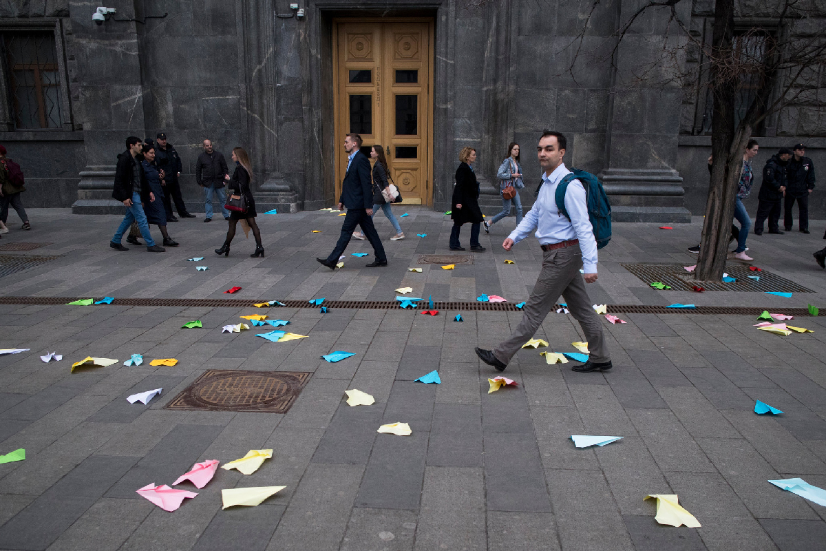
Where censorship is rife and freedom of expression is curtailed, apps like the non-profit messaging service Telegram go some way to upholding Berners-Lee’s dream. Telegram was designed to be a secure messaging service inaccessible to third-parties which allows people to share messages and documents with other Telegram users, as well as setting a timer on the message to “self-destruct” after it has been read or sent. Recently, the app has become a symbol of free speech in Russia.

Demonstrators threw paper airplanes — the corporate symbol for Telegram — in front of the Moscow headquarters of the F.S.B., Russia’s secret police, to protest a ban on the popular messaging app. Credit Pavel Golovkin/Associated Press
Source: New York Times
On a less political note, products like Borrowmydoggy, (which does what it says on the tin) offer something quite remarkable in terms of real-world connection. While the interface perhaps wouldn’t stand out on dribbble, it successfully builds trust and friendship between complete strangers through a shared love of dogs. In a world where loneliness and depression is a growing threat to our health, even greater than that of obesity and smoking, borrowing a pooch might just be the answer.
My favourite app is the one that gives me my attention back.
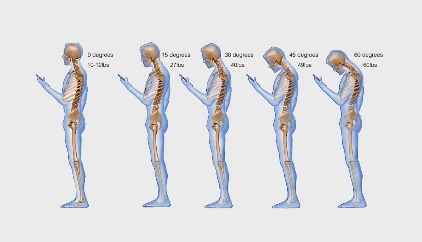
You’ve likely heard the term “text neck”, a 21st-century modern spine ailment caused by our faces being constantly tilted down to our little rectangles as we escape into that soothing scrolling action — surfacing for air 20 minutes later, seconds after missing our bus stop. A digital detox centre in Switzerland goes so far as to define our relationship with our devices as something pertaining to the Stockholm Syndrome, a psychological condition that causes hostages to develop a strong emotional bond with their abusers. We know our attention is held captive but we can’t stop scrolling.

Illustration of the effects of prolonged texting on our spinal position.
Source: FLM Training LTD
Our attention is in limited supply, something marketers around the world are acutely aware of, so it comes as a relief when you stumble across a product that does what it says it would and then gets out of the way. Personal tracking apps such as Runkeeper, MyFitnessPal or meditation app Pause actually draw attention to the present moment and encourage awareness and healthy habits.
“Retention” and “session time” are some much-used metrics for measuring success in product design. However, as our relationship evolves with technology, I feel that we as designers should explore new metrics and value exchanges that enable people to mindfully interact with and leverage technology, while also keeping us in business. A delicate balance.
Recognising our privileges and stepping up
It is sometimes helpful to be reminded that designers and developers make up a fairly small percentage of the population and we’re quite a homogenous bunch at that. We have the enormous privilege to be engaging with emerging technologies and trends early on and, as a result, shape them. We make decisions every day that will affect the end user’s life, in subtle and considerable ways. And nowadays, we’re at a moment in time where people are losing faith and patience with the lack of transparency of the “tech world”. So now more than ever, we need to help people feel they can genuinely engage in discussions surrounding technology, rather than dismiss it.
The above example “talking points” are ones that have helped me go from a mundane chat about “apps” to discussing free speech, solving loneliness and the importance of living in the present. My hope is that the people I talk with will feel involved and reassess how they engage with the apps or services they use and reflect on whether they really are getting a fair deal. Perhaps the next time they try a new way of doing things, they’ll stop to consider what and who it’s replaced. Finally, I hope they’ll want to be more mindful of where they spend their attention while unlocking how to enhance their every day with technology.
“Design exists beyond screens – it has an impact on real life”
Paula Scher, Graphic Designer, Painter, Author and Educator
So, the next time someone asks you what your favourite app is, maybe it’s time for a new approach… let’s keep nerding out on dribbble between us designers, but when the opportunity presents itself to invite more people in, we should do our best to engage their interest.
Want to learn more about UI design? Here are some other guides you’ll find helpful:
