With simplicity, flat design and minimalism gaining even more steam over the past few years, will these trends continue as the design world enters into 2025? Or will new trends appear that cause minimalism and flat design to go the way of skeuomorphism circa early 2008? Or, with nowhere else to go, will realistic design metaphors once again take center stage?
In 2023, some companies and products thrived while others crashed and burned. There are many factors at play when it comes to the success or failure of a product, but at the heart of it all is the user experience. And with 2023 having come to a close, there’s no doubt that the design and user experience of your application is more important than ever.
In this article, I’ll be digging deep into what UI design will look like in the upcoming year across multiple platforms, as well as which design patterns will be brought to the forefront. By projecting these upcoming design shifts and trends, we’ll be able to better prepare ourselves for the brave new world ahead. So strap on your time-traveling hat, fire up your flux capacitor, and hold on. Here are some of the top UI Design trends for 2025!
1. The bar will be raised
Design prophecy #1: In 2025, the bar for what’s considered “great” design will raise even higher. This goes beyond designing a beautiful app. The greatest apps of this year will be the ones where the design and the user experience work perfectly together to create a truly delightful user interaction.
We’ll also see interactions that we’ve never seen before. You think Snapchat had some hidden and questionably innovative UI interactions? Well, other applications will adopt this method, ultimately making these interactions more discoverable and intuitive. Think of the pull-to-refresh interaction which first appear around 2008 in an app called Tweetie.
2. Large imagery is here to stay
Over the last eight years or so, we’ve seen the proliferation of huge imagery that spans an entire web page, or the so-called “Hero” image.
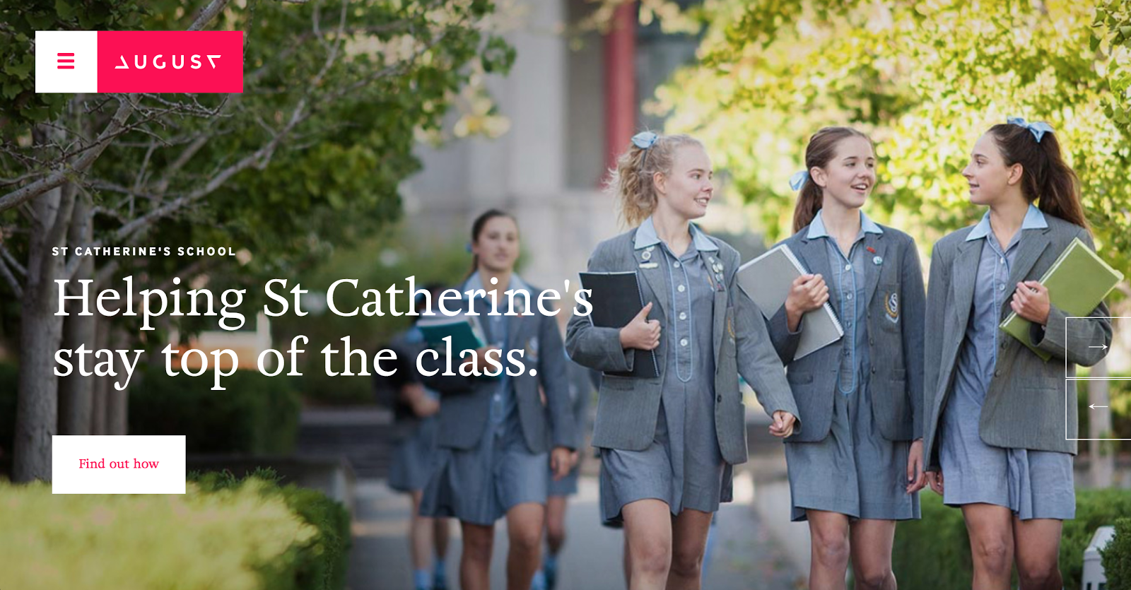 August Digital Marketing Agency
This design trend is still going strong and will only grow stronger. The appeal of this design pattern is that it allows the designer to use emotion-inducing imagery that’s impossible to miss (after all, it takes up the whole page!), while still being able to overlay key information.
But don’t expect to grab any old high res image from Unsplash, slap some text on it and call it a day. There’s truly an art to placing meaningful text on top of an equally meaningful photo, and the best designers will do it the right way.
Large hero units on websites will still be king, but they’ll expand beyond just static pictures. With internet speeds on the rise and video codecs getting better and better at squishing video files, we’ll begin to see more video incorporated into headers and backgrounds instead of still imagery.
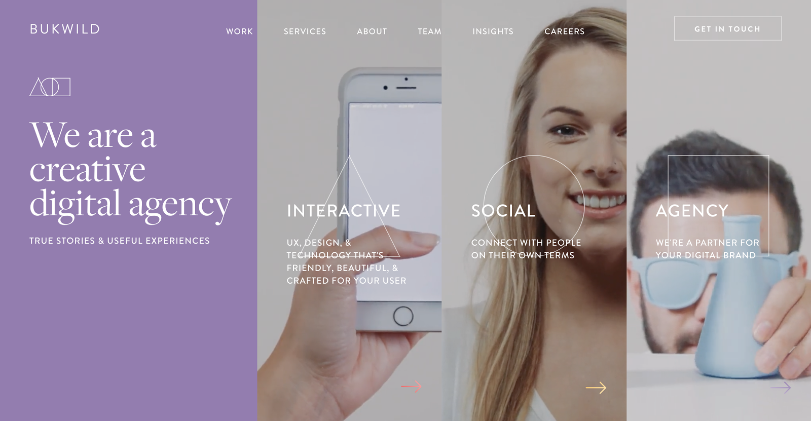 BUKWILD uses multiple video backgrounds in their header
Hero images will also continue to expand well past the web arena. We’ll see more and more mobile and desktop apps using large, screen-filling imagery and video.
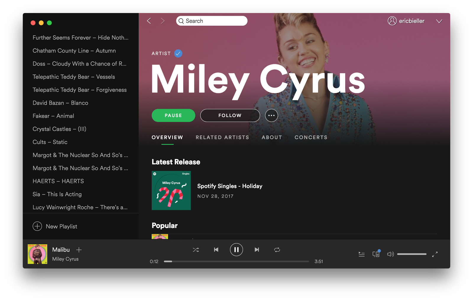
3. Long live Skeuomorphism!
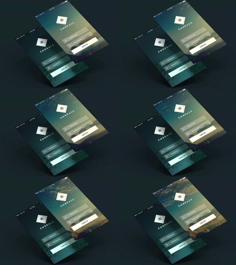
Simply put, Skeuomorphism is when digital interfaces seek to mimic real-world interfaces. This concept was first conceived in the 1980s, with the advent of familiar and realistic digital metaphors like trash cans and save icons. This trend continued until around 2008 when Apple released a new version of iOS which was focused on flat design. Pretty soon the entire design world followed suit.
Flat design was an extreme response to the overuse of Skeuomorphism in design. But while Skeuomorphism comes with its own set of criticisms, flat design does too. Skeuomorphism is good because it evokes familiarity in a user. They already know how a trash can works in real life so the jump to a digital trash can is easy.
But when interfaces start to become bogged down by realistic leather textures and ripped paper, it’s starts to be a bit much. Conversely, flat design does a great job of simplifying interfaces, but sometimes they become too simple. Without shadows or realistic metaphors, it can be hard for a user to understand how something works without first being trained.
Neither design style will die out, but instead we’ll see them used more appropriately, like with flat 2.0 (which can read more about in our guide. For example, smartwatch interfaces inherently benefit from being skeuomorphic while mobile phone stock apps benefit from flat, clean design.
4. The continued rise of Type Design
We’ll also see a rise in simple, typography-based designs which aim to use type itself as the main element of design.
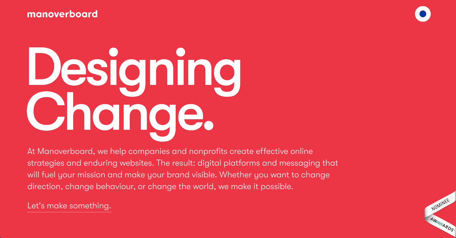 Manoverboard uses typography as their main design components
This form of design seems simple but is actually pretty tough to pull off and can be beautiful when done right. To make sure that you know which kinds to keep your eye out for this year, we’ve collected eight typography trends.
This form of design will grow in popularity—especially for content-based sites and apps—because of its simplistic and flat nature, which draws the user’s focus to the content rather than the design.
5. Increased focus on security
With the last few years being some of the worst for data breaches, consumers have become more concerned with the security precautions taken by the web services they use.
Because of this, we’ll see even more lock icons, verified badges, and other security-reinforcing copy/iconography which aims to evoke a sense of safety and security in users.
Final thoughts
These are just a few predictions for the design trends we’ll see this year, but by no means is this list exhaustive. If the past few years have taught us anything, it’s that things in the digital sphere can change fast.
If you’d like to read more about the world of UI design, check out these articles:
