Gaming—be it mobile, console, or PC—is a huge, and still growing industry, with a multitude of opportunities for passionate and skilled UI designers looking to break into the field.
But the game design industry can look unapproachable and the idea of breaking into it can seem daunting to would-be game UI designers.
Don’t worry, we’re here to help. If you’re interested in getting into the field of game UI design, stick around.
This guide to game UI goes hand-in-hand with the recently published Game UX: The Complete Guide for 2025. Together they’ll tell you everything you need to know about game UI and UX, their respective markets, and how to break into the industry.
In this article, we’ll first get an understanding of what game UI is before giving you an overview of the key interface components in game UI and the categories they fall under.
After that, we’ll talk about what makes a great game UI and share some examples of these in action. Finally, we’ll walk you through the current state of the game UI design market, before we wrap up with some key takeaways.
You can use this clickable menu to skip ahead to any section:
- What is game UI design?
- The game UI design market and demand
- Interface components in game UI
- What makes great game UI?
- Examples of great game UI in action
- Final thoughts
What is game UI design?
First things first, what is a game UI?
Put simply a game UI is an interface that’s there to help players break through the fourth wall (the invisible, imaginary wall that separates the game from players) and engage with the game by:
- Navigating through the game
- Finding the information they need
- Accomplishing their in-game goals
A game UI isn’t there to attract the player’s attention. Instead, it’s there to increase playability and help to build the seamless, immersive experience that makes up the best games.
It does this by creating visual cues to help players follow the right course of action in the games. These visual cues can be subtle or obvious; either way, they’re there to empower players to be decisive and confident in their journey through the game.
As you’ll have guessed by now, game UI design is the craft of designing, building, and testing game UIs.
The Game UI design market and demand
The gaming industry continues to go from strength to strength, with growth described as “stunning” by Ernst & Young in their analysis What’s possible for the gaming industry in the next dimension?
Ernst & Young noted a significant expansion as an “estimated 2.9 billion people played a video game in 2021” and “global revenue for the industry exceeded $193 billion.” They also cite a compound annual growth rate in the gaming industry of 15.6% from 2016 to 2021—rapid to say the least.
Naturally, this industry robustness is good news for game UI designers. There is a strong and increasing demand for skilled game UI designers and industry salaries are generally good.
Salary
Glassdoor figures (as of December 2023) have the average total pay for a game UI designer as $125,976 annually. This is made up of $105,332 in base pay and $20,644 in additional pay.
They also quote a total pay range from $81K up to $199K, which will, of course, vary by experience, job level, location, company, and more.
As is normally the case, industry experience will give you an advantage when trying to get a job as a game UI designer, but it is possible to carve out opportunities without direct experience if you have the right skills, mindset, persistence, and approach.
You can find advice on getting into game design in our Complete Guide to Game UX. (Although most of the advice is in the context of breaking into game UX design, it’s also applicable to game UI design.)
Now that we’ve established both what game UI design is and the explosive game UI design market let’s take a closer look at some of the components that can make up a game’s user interface.
Interface components in game UI
Before we can begin to understand components in game UI, we first need to introduce two concepts that shape the four categories game UI components can fall into.
Narrative
In simple terms, the narrative is the story that the game tells the player.
The Fourth Wall
The fourth wall is the imaginary, invisible wall that separates the player from the space in which the game takes place. (The concept of the fourth wall massively predates gaming—it’s thought to have been coined by the French philosopher and art critic Denis Diderot in 1758. Fourth walls also exist in theater, television, cinema, and literature.)
But, how do narrative and the fourth wall relate to game UI components?
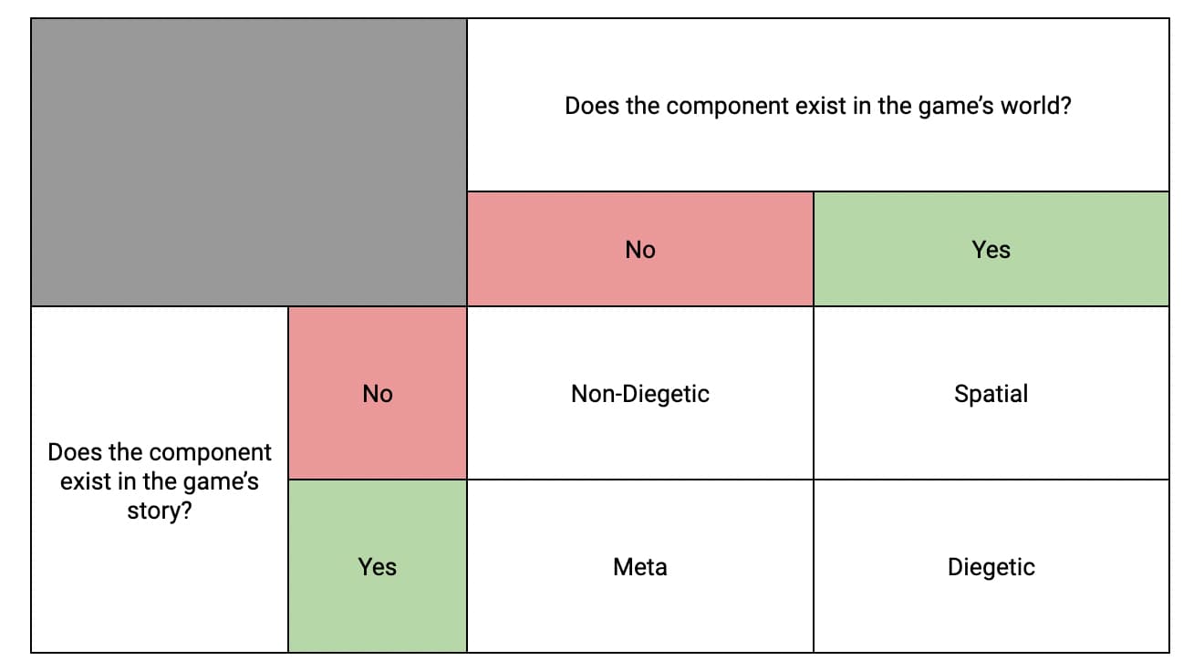
All game UI components are categorized based on whether or not they exist in the narrative and in the game space (behind the fourth wall).
Which category a component belongs to depends on the answers to two questions:
- Does the component exist in the game’s story?
- Does the component exist in the game’s world space?
Four categories of game UI components emerge from the answers to these questions:
- Non-Diegetic
- Diegetic
- Spatial
- Meta
This table will help you understand how game UI components are categorized based on these questions:

Now that we’ve looked at the framework behind game UI components, we’ll look at each of the four categories in a little more detail.
- Non-Diegetic
- Does the component exist in the game’s world? No
- Does the component exist in the game’s story? No
Existing outside both the game’s world and story, diegetic components are only ever seen by the player.
None of the characters in the game are aware of these components and they play no role in the game’s narrative.
But their purpose is vital. They help the player track their performance or progress and non-diegetic components include things like point tables or stats meters, menu screens, and health bars.
Designing non-diegetic components soundly and placing them in context is crucial to a game’s playability.
Especially in fast-paced games, non-diegetic components need to be positioned carefully so as not to interrupt a player’s sense of immersion.
- Diegetic
- Does the component exist in the game’s world? Yes
- Does the component exist in the game’s story? Yes
Existing in both the game’s world and story, diegetic components can be seen or heard by characters in the game and serve a purpose in the narrative.
Diegetic components include things like holograms, phones with visible screens, and speedometers. They’re usually seen in the game’s world on a small scale, which can make them difficult for the player to view.
Because of this, some handheld diegetic components, such as maps, can be toggled to a full-screen view. Doing this makes them non-diegetic, as they no longer occupy the game space and the character is no longer aware of them.
Badly designed non-diegetic components are one of the biggest reasons for poor playability as they can frustrate and confuse players.
- Spatial
- Does the component exist in the game’s world? Yes
- Does the component exist in the game’s story? No
Spatial components exist in the game’s world, but not in the game’s story. This means the player can see them on the screen in the game space, but the characters can’t, and they don’t serve a purpose in the narrative.
Things like text labels, arrows showing where a thrown object will land, and character outlines showing who enemies are, are all examples of spatial components.
Spatial components are an important part of overall playability. As visual aids they guide the player towards their next action, whether it’s selecting an object, approaching a landmark, or choosing the correct path.
- Meta
- Does the component exist in the game’s world? No
- Does the component exist in the game’s story? Yes
Meta components don’t exist in the game’s world but do exist in the game’s story.
Examples of meta components include things like scrolling text and colored overlays to indicate changing health levels.
While some meta components are subtle, others are deliberately prominent. For those of you who play action and adventure games, the experience of taking damage and your field of vision getting blurred, shaken, or discolored might be familiar. These changes are indicated by meta components.
Now we’ve looked at the four categories of game UI components, we’ll quickly introduce you to the heads-up display, or HUD.
What is a heads-up display?
Sketch describes the HUD as “an overlay that houses all sorts of UI elements” and “where the player will find most of the information they’re looking for as they play the game.”
The HUD, which takes its name from the heads-up display in modern aircraft, is essential to playability.
HUDs can exist both during gameplay and when the game is paused.
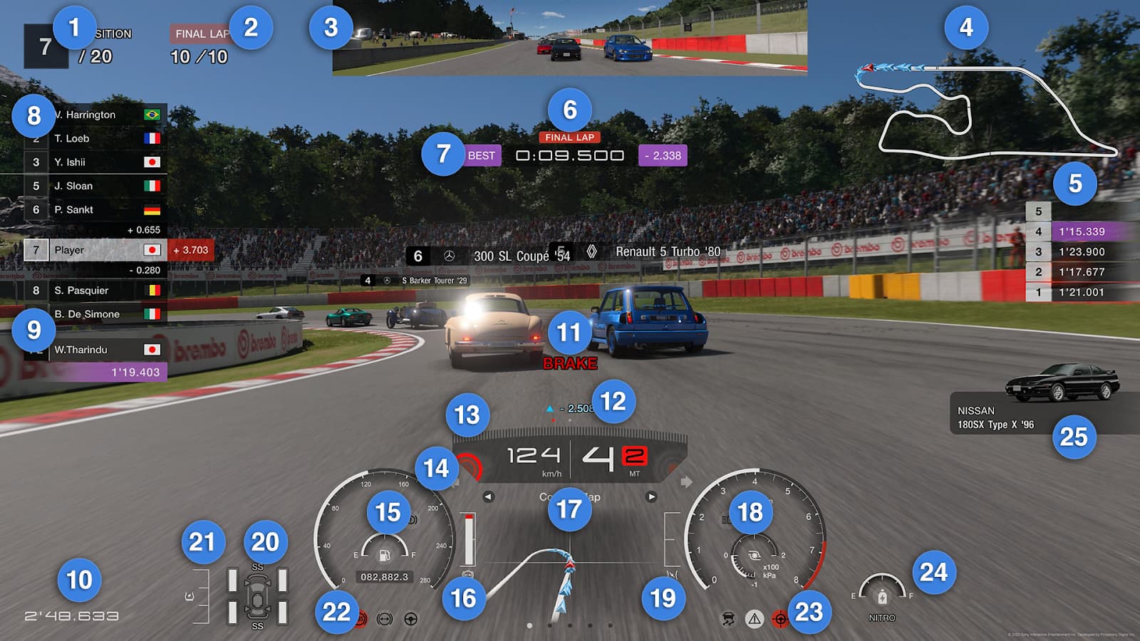
This example from Gran Turismo 7–with annotations courtesy of the GT7 Online Manual–shows a complex in-game HUD.

Amongst the 25 UI elements listed you’ll find examples of diegetic, non-diegetic, and meta components:
- Diegetic: The Rear-view Mirror (3) and Speedometer (15) are diegetic components as they can be seen by the character (the driver) and they serve a purpose in the game’s narrative.
- Non-diegetic: The Braking Suggestion (11) is an example of a non-diegetic component. It can be seen by the player, but not the character, and it doesn’t exist in the game space or serve a purpose in the narrative.
- Meta: The Position Indicator (8) & Fastest Lap Notification (9) are classic examples of meta components, as both serve a purpose in the game’s narrative, but don’t exist in the game space.
As this example from GT7 shows, players might need lots of different pieces and types of information while they play the game. This is where great game UI becomes a game changer.
What makes great game UI?
Understanding what makes great game UI brings to mind a quote from Jared Spool, the well-known usability expert and the founding principal of User Interface Engineering (UIE):
“Good design, when it’s done well, becomes invisible. It’s only when it’s done poorly that we notice it. Think of it as a room’s air conditioning. We only notice it when it’s too hot, too cold, making too much noise, or the unit is dripping on us. Yet, if the air conditioning is perfect, nobody says anything and we focus, instead, on the task at hand.”
Spool was talking about design in a much broader sense than game UI of course.
But everything he said resonates if you’re trying to understand what makes a game UI great. A few tweaks to his quote illustrate the point:
“Good game UI, when done well, becomes invisible. We only notice it when it’s distracting us, confusing us, or is too difficult to find or use. If the game UI is perfect, nobody says anything and we focus, instead, on the task at hand–gaming.”
Just as nobody uses their mobile banking app because they love analyzing the nuances of the UI, no one games to assess game UI.
Instead, like mobile banking app UIs, they’re merely a function–albeit a crucial one–to support user experience, or in this case, playability.
Because of this, a great game UI is:
- Unintrusive: It doesn’t get in the way or distract from the gameplay, but masters space efficiency to give players information smoothly.
- Clear: It doesn’t frustrate or confuse players but is informative without being overly complex.
- Convenient: It’s not difficult to find or use, but is a natural, usable, and accessible part of the experience.
Now that we’ve gone over what makes a great game UI, it’s time to take a look at a couple of examples in action.
Examples of great game UI in action
We’re now going to take a look at two examples of great game UI from very different eras.
The Legend of Zelda: Ocarina of Time
The Legend of Zelda: Ocarina of Time remains the first love for many gamers of a certain generation and critics would agree—it’s been rated as the best game ever by many publications and regularly features on top 10 or 100 lists.
Its UI introduced features such as the target lock system (this was known as Z-targeting in Ocarina of Time) and context-sensitive buttons. Both of these are now common UI components in the action and adventure genre.

Source: Tropedia: Camera Lock-On
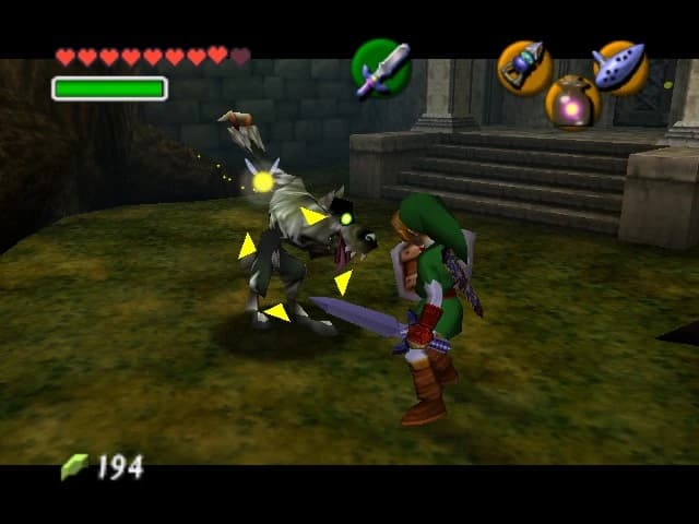
This example shows the target lock system in action. A groundbreaking development at the time, it allowed the player to focus their view on an object with a tap of a button, and move around freely while keeping the object in sight.
The target lock system was an example of a spatial game UI component, as it was present in the game space, but not in the game story.
In this case, Link couldn’t see the actual target lock and it didn’t serve a purpose in the story, but it did exist in the game space. It was a visual aid for players that helped create a more immersive, enjoyable gaming experience for players.
(For more on Ocarina of Time and a broader history of the Zelda series up to 2012, take a look at IGN Presents the History of Zelda.)
Fast-forward twenty years and another outstanding game UI comes onto the scene, groundbreaking in whole new ways.
Dead Space
Akhil Dakinedi, in his ultra-sharp analysis of the Top 5 Best Video Game UIs, describes Dead Space as “the poster child flagship example of how a diegetic UI can truly harness the power of the gaming medium”.
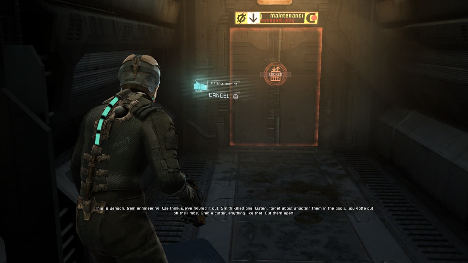
Pointing to how Dead Space has taken inspiration from Metroid Prime’s HUD, he highlights how it extracts the UI out of the helmet directly into the game UI, so the components live in the world around the player.
This results in menus being holographic pop-up displays, with a nod to sci-fi movies. As interaction with these menus doesn’t pause gameplay, UI interaction happens in real-time.
Dead Space’s sophisticated diegetic UI in action:

Source: Game UI Database
Because of this extraction of the UI directly into the game, most of the UI elements in the game are diegetic, as they appear both in the game space and the game story.
And Dead Space’s game UI design is so widely-respected because it blends seamlessly with the game’s world and narrative.
Now that we’ve looked at two examples of great game UI in action, it’s time to give you an overview of the game UI design market.
Final thoughts
If you’re aiming to be a game UI designer there’s never been a better time to carve out your career in the industry.
You might be feeling apprehensive about getting into what can look like a daunting industry, but taking practical steps to build up your knowledge about game UI design—and UI design more broadly—will give you the confidence and motivation to keep going.
Immerse yourself in the subject area. Learn the components, their use cases, and their categories according to their relationship with the game story and space.
Play a lot of games, read about them, write about them. Analyze them ferociously. Understand the history and evolution of game UI.
When it comes to applying for jobs, cast a wide net and be persistent. Ask people in the industry questions and get mentorship, if possible.
And remember, game UI design is built on the foundation of broader UI design. The principles that apply to game UI design are from UI design.
If you’re looking for a good place to get started, our free UI design course might be the perfect jump-off point. To learn more, speak directly with one of our program advisors.
If you found this article useful, you might also be interested in:
