An average resume won’t make it past the AI resume screening tools HR professionals use to separate the wheat from the chaff. A good resume will capture a hiring manager’s attention for a millisecond. However, a great resume will help get you an interview and possibly land you a job.
But what’s the difference between good and great, especially for a specific career like a product designer? Take a peek at some very thoughtfully crafted resumes that will give you some inspiration for your own to get your creative juices flowing.
This article will evaluate several top-notch product design resumes, highlight helpful techniques, and point out improvement opportunities. Use these tips to help you create the product designer resume that will land you your dream job.
Table of contents
13 great product design resume examples
Nobody’s resume is perfect, but here are some that come pretty darn close!
1. Eva Lee
What works
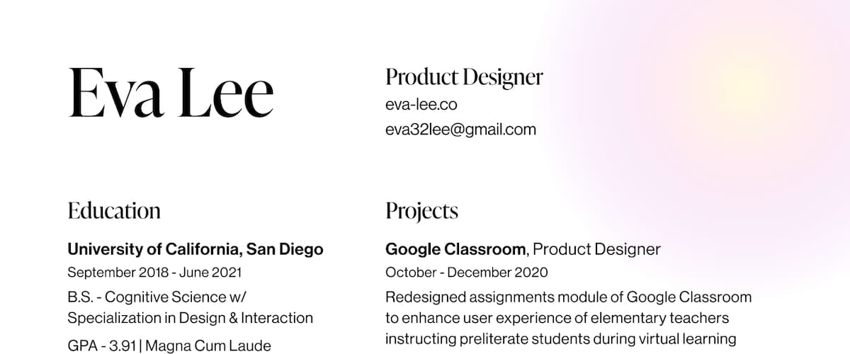
- Eva’s work experience, projects, skills etc., are clearly defined and easy to scan
- She clearly states that she’s a product designer up front, indicating she is applying for the right job
- The pop of color at the top right-hand corner makes her resume stand out from other black-and-white versions
- She lists her portfolio website (including a hyperlink to her portfolio as part of the resume) and contact information at the top for easy access
- Her skills are aligned with the role of product designer (and ostensibly what’s listed in the job description)
- Listing projects makes her look more seasoned, even without substantial career experience
How to improve
- Her product design resume lacks an objective that states her career goals
- She uses longer sentences as descriptions rather than short bullet points, which makes it harder for a hiring manager to scan her resume quickly
- There is no phone number listed, which may dissuade a hiring manager
2. Shavonne Yu
What works
- She lists her contact information, social media profiles, and role up front
- A colorful logo adds a unique flair that will stand out
- She uses headers that make it easy to differentiate between sections of her resume, like experience, projects, skills, tools, etc.
- Lines with blue dots add visual appeal that help break up the text
How to improve
- Adding a phone number can help a recruiter or hiring manager contact her
- The font size is very small, especially in the tools and skills section, making it harder for someone to read and scan her resume
- Missing a career objective or summary of what she is looking for in a role
3. Brandon Cooper
What works
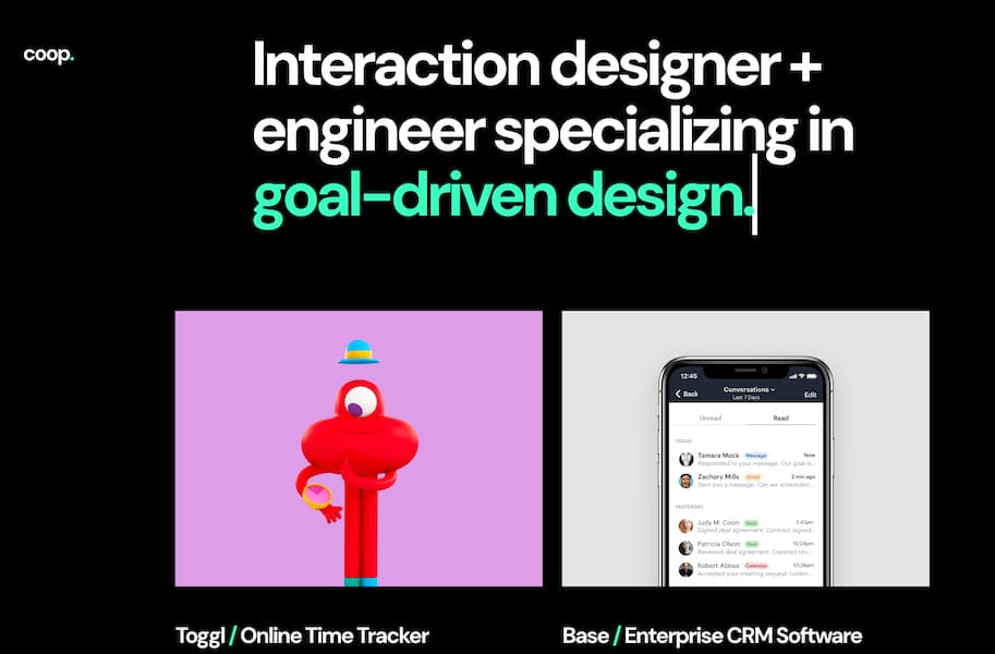
- Career objective states what he is most interested in, which helps a hiring manager determine if he might be the right fit for a job
- Contact information and website (with hyperlink) are at the very top of the resume so they don’t get lost
- Perpendicular section headers add whimsy and break up the monotony of the text while allowing a reader to find desired information quickly
- He fits a lot of information in a small space
How to improve
- Descriptions of his job roles are brief and may not provide enough detail to differentiate him from other applicants
- The font used for the body text is small and may be hard to read
4. Yingyu Liu / Ava
What works
- It’s easy to see her job titles and tenure at each job
- Contact information is listed clearly at the top
- She calls out “notable clients” with brand-name recognition to improve credibility
- Her job duties for each company are very comprehensive and align with those of a product designer, proving she has relevant experience
- Bullet points make each section easy to read
- Novel logo at the top adds a touch of personality
- Her skills and tools are in line with those listed in product designer job descriptions
How to improve
- A concrete career objective would help her stand out and confirm her career goals are aligned with what the position offers
- Including projects she completed for high-profile clients could help differentiate her from other applicants
View Yingyu Liu / Ava’s resume
5. Carol Chu
What works
- She lists her awards and accolades as third-party proof of her demonstrable talent
- Lowercase section title headers are a rarity in resumes, but work in this situation because she is communicating her willingness to think outside the box
- Includes and emphasizes quantitative results of her work (e.g., 1.7M monthly users, 50% increase in engagement, etc.) to tie her efforts to company goals
- Clearly defined sections make her product design resume easy to scan
- The community section proves her dedication to her craft
How to improve
- Skills are hard to read without bullet points separating them
- Missing a career objective
6. Christy Hu
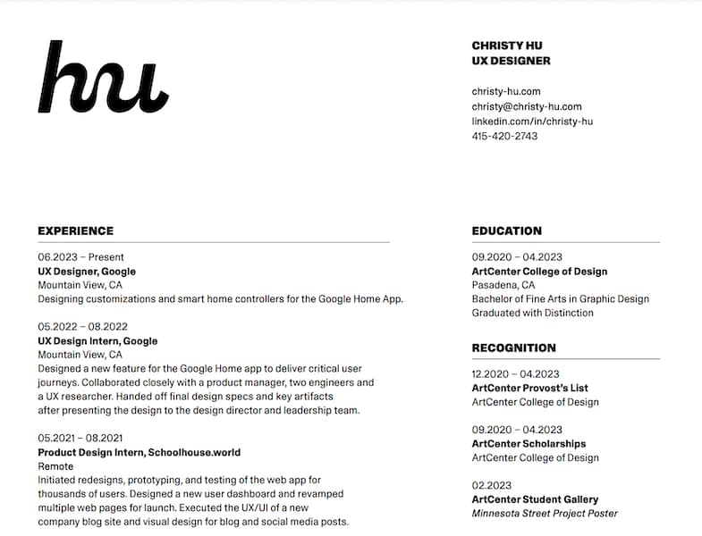
What works
- Her contact information, including a link to her website and portfolio, are clearly visible at the top
- She uses consistent type and formatting throughout to achieve a cohesive design aesthetic
- Underlines and bolded font help a reader easily identify and differentiate each distinct section
- Includes awards and accolades
- She succinctly describes each job experience without sacrificing important information
- Her unique logo is eye-catching without being overwhelming
How to improve
- Her job experience content may be challenging to read without bullet points separating each sentence
- Missing a career objective
- Very small font may make it hard to read, then force readers to scroll more if they enlarge the screen
7. Youjin Choi
What works
- The bold resume color immediately sets her apart from the competition by visual appearance alone
- She includes her contact information and portfolio at the top
- It’s easy to scan her job titles and education
- She lists her impressive awards
How to improve
- Though eye-catching, the pairing of the background and text color makes it harder to read the content
- The font size is tiny, compounding the difficulty in reading her resume
- Job descriptions would be easier to read in bullet point format
- The awards section is not easily distinguishable from her job experience and education
- Does not include career objective or role
- No phone number listed
8. Sophia Yang
What works
- Her product design resume boasts a spare, modern layout with clean lines
- It’s easy to identify each distinct section of her resume
- She uses a larger, bolded font to draw attention to her titles at her past jobs, making it effortless for someone to scan and confirm she posesses relevant experience
- Her skills are arranged such that there are no more than three words in a given row, minimizing confusion for the reader
- Sans serif font is large and has enough weight to be easily read
How to improve
- At its current size, her logo gets a little lost amongst the other content
- No career objective or job title is included
- Adding a hyperlink to her website in the resume would produce a frictionless experience
9. Winona Nasser
What works
- A brightly colored logo with an exclamation point exudes energy and passion
- Clearly states her job title
- She only includes a single skill and tool on each line, making them easy to scan
- Personal details offer insight into her personality
- She highlights her leadership roles and awards
- Overall clean, aesthetically-pleasing product design resume layout
- Skills and tools align with her role
How to improve
- Contact information and portfolio are at the bottom of the page, making them harder to find; the resume also lacks a phone number
- Job description font is very small
- The gray color she uses for her job duration makes the tiny font even more difficult to read
- No career objective
10. Misba Abbas
What works
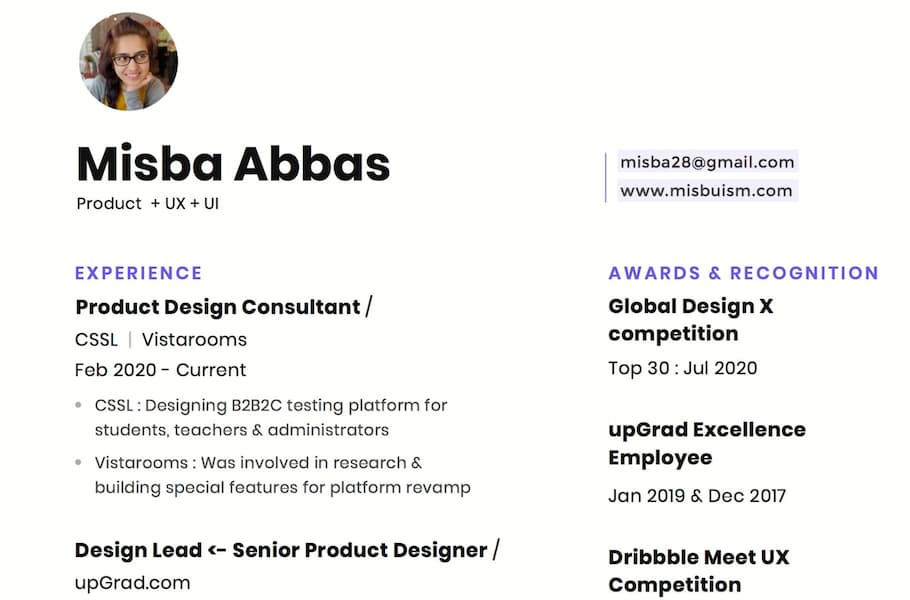
- Including a photo reminds the reader there is a real person behind the resume
- Her contact information and portfolio site are clearly visible at the top; each is a hyperlink for frictionless access
- Type size and font make her resume effortless to skim; purple color helps separate each section
- Carefully chosen pops of color differentiate her resume from others and add aesthetic appeal
- Vertically stacked skills and tools facilitates reading comprehension
- Bullet points and short sentences in job descriptions adequately communicate her responsibilities without overwhelming the reader
How to improve
- No career objective
- No phone number listed
- Her promotions at each job are not immediately obvious
- Her product design resume is larger than a traditional 8.5×11 page, which could prove problematic for a hiring manager to print out
11. Robin Nogiuer
What works
- Prominently placed logos of well-known past clients provide proof that Robin is sought-after designer
- He’s facing his name in his image, helping draw more attention to it and his title
- His skills are obviously displayed
- Colored flag icons visually illustrate that he has clients worldwide
- Includes several awards and recognitions
How to improve
- It’s a busy resume overall: a reader may find it hard to follow without carefully reading it
- No career objective or contact number listed
12. Kyson Dana
What works
- Well-written career objective positions him as a multi-talented candidate
- Large, bolded work experience titles allow a reader to quickly grasp his career trajectory
- Overall sleekly designed resume
How to improve
- Contact information and portfolio links are relegated to the bottom where they could get lost
- Small, serif typeface used for the majority of his content could be hard to read
- Links are not hyperlinked, forcing a reader to copy and paste the URL
- Skills are not explicitly called out
13. Luke James Taylor
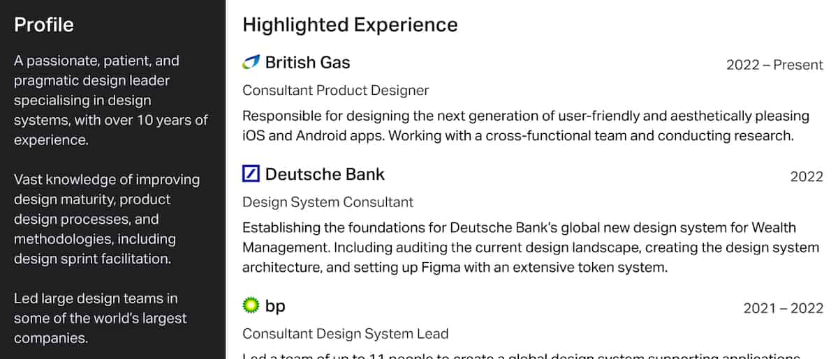
What works
- Comprehensive career objective divided into two separate sections (descriptive title and “profile”)
- Includes glowing recommendations from former colleagues
- Photos (above his profile and reference photos) help the reader envision him as a real person
- Company logos added to each job experience provide a creative touch that sets each experience apart
- A simple sans-serif fonts supports better reading comprehension
How to improve
- A two-page resume full of information can be overwhelming
- The job description and achievements are in paragraphs, making them harder to read
- He duplicates the information in his profile on both pages using valuable real estate he could allocate to white space or additional information
- His skills are not immediately apparent; you need to parse them out
- The layout is a touch crowded and may confuse readers without clear information hierarchy
- It does not list his phone number
View Luke James Taylor’s resume
Tips to make your product design resume stand out
Now that you’ve been properly inspired, it’s time to learn how to make your product design resume rise above the rest. Here are some tried-and-true techniques to create an eye-catching CV:
Use color (sparingly)
Don’t go overboard—remember, less is more when it comes to color on a resume—but feel free to create a unique logo, highlight specific sections, or emphasize different elements using color.
If you’re concerned that your technicolor flourishes will make you look unprofessional to a potential employer, keep it simple: limit your palette to a single bold shade and only use it for your name or section headers.
Include references
A reference is immediate social proof that you’re a commendable candidate. You have one or two people who are so excited to speak on your behalf about your stand-out work performance they’ve authorized you to put their contact info on your resume. You must be good!
Align your career objective with the job description
Don’t go overboard on reiterating it, but make sure your career objective covers the main tenets of the job you are applying for. A hiring manager will immediately feel reassured that they’re reading the resume of someone genuinely interested in the job they are offering.
List relevant skills, but don’t go overboard
No need to include your amazing proficiency with outdated technology (even if you are really great at creating amazing Word Perfect documents) or irrelevant abilities. Look at the job description and include all the skills you possess that match. It’s okay to put a skill that you’re still ramping up, as long as you feel comfortable getting up to speed quickly if you get hired.
Add awards or recognition
If you’ve got ‘em, flaunt ‘em! (As long as they’re relevant to the job and are relatively recent, within the past five years.) Awards elevate you as a candidate and set you apart from the competition.
Final thoughts
As this blog post illustrates, there is no single “right” way to create a product design resume. You can leverage many techniques and visual elements to craft a unique resume that perfectly communicates your value to a company.
If you’re excited by the idea of product design but not sure if it’s the career for you, try Career Foundry’s free product design short course. You have nothing to lose and everything to gain!
If you’d like to explore some more of the product design world first, check out these reads:

