If you are an aspiring data analyst, you have probably heard of pivot tables. You might have even used a pivot table already, perhaps without realizing it. Pivot tables are a staple in any kind of analysis, and, if you’re building a career in data, you’ll come across them quite often in your day-to-day work. So what exactly is a pivot table, and what are pivot tables used for?
In this post, we’ll provide a clear and comprehensive introduction to pivot tables, and show you what you can achieve by using them.
We’ve divided our guide into the following sections:
- What is a pivot table?
- What are pivot tables used for?
- Pivot table functionalities
- Wrap-up and further reading
What is a pivot table? Let’s find out.
1. What is a pivot table?
A pivot table is a summary tool that wraps up or summarizes information sourced from bigger tables. These bigger tables could be a database, an Excel spreadsheet, or any data that is or could be converted in a table-like form. The data summarized in a pivot table might include sums, averages, or other statistics which the pivot table groups together in a meaningful way.
The name “pivot table” actually offers quite a good clue as to their importance and the role pivot tables play in analysis; the dictionary definition of a pivot is a ‘central point, pin, or shaft on which a mechanism turns or oscillates’. This is a very important concept when it comes to conducting data analysis. A database or a dataset typically contains all the information you have been provided with on a certain subject. The very goal of any analysis is to draw insight from this raw data. However, there isn’t much you can say about a table with thousands of rows just by looking at it with the naked eye and scrolling up and down. Drawing insight very often means that you will have to take out certain pieces of the data and wrangle the way they present their content, for example, through summary statistics. Summary statistics are used by data analysts to summarize a set of observations in order to communicate a large amount of information as simply as possible.
Want to try your hand at creating a pivot table? In this free tutorial on exploratory data analysis, we’ll show you, step by step, how to create pivot tables for a real dataset. Give it a go!
2. What are pivot tables used for?
Now we know what pivot tables are, let’s take a closer look at how they might be used. As already mentioned, pivot tables enable data analysts to summarize large datasets into a concise and meaningful table which can be consumed at a glance.
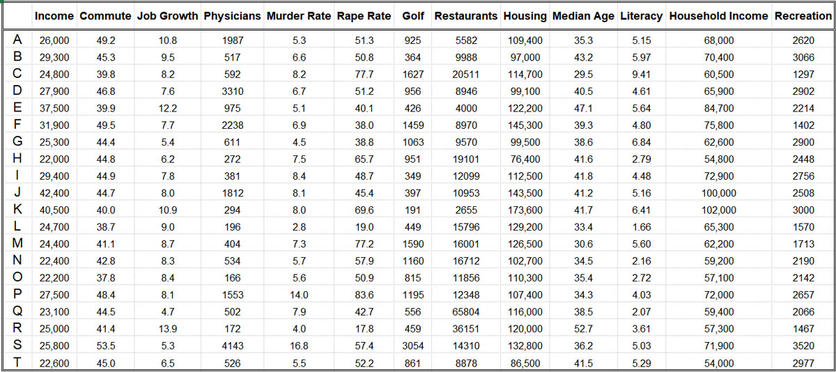
Let’s take a look at a practical example. Below is a small table that contains information about various criteria used to rank the states in America according to quality of life. The raw data shown here relates to the key cities in the state of Florida and their results in various categories.

You can see here that every row stands for a different city (although the names have been anonymized and replaced with a letter from the alphabet). For each row there is a metric, which offers information for a given criterion (listed in the columns). Now, if you received this dataset and were asked to summarize these characteristics for the entire state of Florida, what would be the easiest way to do so?
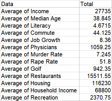
You guessed it: with a pivot table. With just a few clicks, you can produce a clear summary like the one in the small table below, which shows an average for all the cities distributed by the metrics in the table.

Shortcuts like this one are very handy, especially if you need to compare more entities. If you weren’t familiar with pivot tables, you would have to type the Average() formula for every column in the input dataset and then format the resulting table so that it looks like the one above, which would take considerably more time, effort and attention.
In the example above, we only have information about Florida; however, it could be the case that you receive a large database with data about key cities in all states of the USA, with the task to compare summary statistics for all of them for the ranking. Again, using a pivot table can aid you in finalizing this task in a very short time.
So, to summarize, the most important usage of pivot tables find a role in:
- Creating a summary of a large database/dataset
- Doing so in a quick and handy manner
3. Pivot table functionalities
The example we gave in the previous section covered just one of the many functions that pivot tables are capable of. In the previous example, we needed to calculate averages. But what other functionalities do pivot tables have?
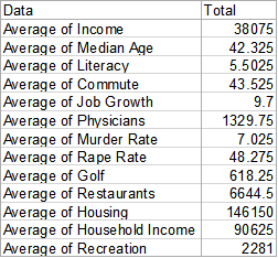
Firstly, you can calculate other descriptive statistics too. Descriptive statistics are measures that show quantitative characteristics about the data, such as count, sum, min, max, product, variance, and standard deviation. You could also choose how this summary table will look; in the Florida example, we have the summary categories distributed as rows in the table, but they could be in the columns though, too. You can also filter data within the pivot table, so that you end up with a result only based on certain criteria. For example, we could look only at the cities that have a personal income higher than 31,900$ on average. This would change the previous table into this one (below), simply by applying one filter:

You can see that, with very little effort, we have changed the perspective of the analysis. This also raises another point: pivot tables are an excellent tool for exploratory analysis. Exploratory analysis refers to discovering some baseline statistics and characteristics about the data, which gives you guidance about the nature of its contents. This could include descriptive statistics as well as missing observations and extreme values in the dataset. Using some grouping techniques and summary measures in a pivot table, you could perform some quick explorations.
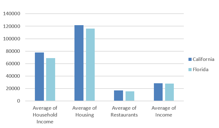
Pivot tables also support another handy tool for exploratory analysis. Once you have your data summarized, you can create some plots like bar charts and scatter plots in order to visualize your findings. For example, imagine you had some equivalent data also for the state of California and you would like to compare the means of selected columns for both states. This is what this would look like:

Instead of looking at the numbers in the table, you can easily create a bar chart where the differences between the two states are much more visible, as seen below.

To recap, here are the main functionalities of pivot tables:
- Calculate various descriptive statistics of the underlying data
- Filter data based on a specific criterion/criteria
- Create visualisations of the conducted analysis
4. Wrap-up
In this post, we explored the role of pivot tables in basic analysis. We looked at a few examples of why this type of pivoting your data is important and how it could speed up your work. Let us sum up the key takeaways so far:
- Pivot tables are great for creating summary statistics with any metrics you want, including showing only the data you are interested in by applying filters
- The result of these tables with summed up metrics could be used for exploratory analysis
- It is easy to carry on with data investigation through the user-friendly visualizations that can be created in pivot tables
The best part about pivot tables, especially in Excel, is that they act like dynamic reports. The tables you create contain statistics and results you could present to a stakeholder, but additionally, they are not static, which means you can change them all the time without starting from scratch. Creating a pivot table in Excel has its intricacies, but once you get the knack of it, this skill will soon start paying itself off. We’ll show you how to create a pivot table in this step-by-step guide.
For a hands-on introduction to data analytics in general, try out this free five-day short course. And, if you’d like to learn more about key data analytics tools and techniques, check out the following:
