Pivot tables are a very important tool when it comes to analyzing larger datasets and data tables. They are quick to create, they carry a lot of synthesized information, and their output can easily be modified for further applications.
So, if you’re an aspiring data analyst, you’ll certainly need to get to grips with pivot tables and learn how to create them.
In this post, we’ll provide a simple, easy-to-follow tutorial showing how to create a pivot table in Excel. We’ll start with a quick refresher on what pivot tables are and what they’re used for; then we will explore what tools can be used to create a pivot table. Last but not least, we’ll show you how to create one!
If you want to skip straight to the tutorial part, you can jump ahead using the clickable menu. We’ve divided our guide into the following sections:
- What is a pivot table?
- What are pivot tables used for?
- What tools can be used to create a pivot table?
- How to create a pivot table in Excel: A step-by-step tutorial
- Wrap-up
Wanna learn what a pivot table is, and how to create a pivot table in Excel? Well, let’s start then!
1. What is a pivot table?
Pivot tables are a summary tool that helps you synthesize information from a dataset or a database. Summary in this case could mean all kinds of descriptive statistics that the pivot table groups together in a meaningful way. Descriptive statistics are, generally speaking, measures that show, at a glance, quantitative characteristics about the data, such as count, sum, min, max, variance, standard deviation, and so on. All of these give you a good starting overview of what your data looks like.
You’ll find an in-depth introduction to pivot tables in this guide. For now, though, let’s focus on the hands-on aspect of actually creating a pivot table.
2. What are pivot tables used for?
Okay—so now we know what pivot tables are, but what are they used for? Of course, pivot tables enable data analysts to summarize large datasets into a concise and meaningful table which can be consumed at a glance.
Pivot tables are also used to:
- group data into categories
- count the number of items in each category
- sum the items value
- compute average, find minimal or maximal value, and so on
There are several different tools you can use to create a pivot table. We’ll introduce some of the most popular tools in the next section.
3. What tools can be used to create a pivot table?
Traditionally, the main tool used for creating pivot tables is Microsoft Excel. This is because Excel has been around much longer and therefore has a major advantage; it could be found on people’s computers long before all the other tools, so most people are already familiar with it. In fact, pivot tables take their name because of their extensive use in Excel, even though they can be created using a lot of other tools, too.
Another tool used to create pivot tables is Google Sheets. This application, which is a part of the Google cloud of tools, has the advantage that the files are easy to share, since there are plenty of businesses that use cloud services to share work materials. In Google tables, professionals can also simultaneously edit the same document, and version control is way less trouble than in Microsoft Excel.
However, Google tables has one major disadvantage—while the design and the core functionalities do resemble Microsoft Excel, there are numerous differences in the menu structures, the way functions operate, and generally in the workflow, which makes it hard for users accustomed to MS Excel to find the exact tool they are looking for.
Since pivot tables are essentially summary tables with statistics, they can actually be produced in any software that handles analysis—it just might be the case that they won’t be called pivot tables. For example, the group-by functions in both Python and R (coding languages for analysts) offer the same results.
The main disadvantage of using tools such as Python and R for pivot tables is that you’re required to have at least some basic knowledge of coding in the corresponding language. If that’s something that interests you, you’ll find a beginner’s guide to Python here.
To recap, you can use any tool you are familiar with to create a pivot table. Don’t get distracted by the term ‘pivot table’; instead, think of it as a summary table that has wide applications and can be created in whatever tool or software you are used to working with.
In our tutorial, we’ll look at how to create a pivot table in Excel, as it’s the most commonly-used tool for this process.
4. How to create a pivot table in Excel
The basic steps for how to create a pivot table in Excel involve:
1. Insert a pivot table
2. Set an intention
3. Create a summary
4. Create a cross table
5. Create a visualization of the cross table
For this tutorial, we have fabricated some fictitious data to show you how to create a pivot table in Excel with some concrete examples. This data table contains some employee information about the staff of a tech company in the U.S. Here is what the table’s top rows look like:

There are 9 types of characteristics (columns) in this dataset: First Name, Surname, Gender, State, Salary, Age, Family status, Occupation and Region, and 1340 rows of observations. We will now create a pivot table out of this information and see what insights we can draw from it!
Step 1: Insert a pivot table
Before we start, it is advisable to always check whether your input data has missing values, since this will skew the result of the summary statistics. You should also make sure that the column names are correctly and consistently written (no mistakes or unclear names), because these will be the labels in your summary table. Last but not least, you should make sure your input data doesn’t have any subtotals in the rows or columns—this will severely affect the result from the pivot table summary.
With your data ready to go, it’s time to create that pivot table. As a first step, you should select the entire table (you can easily do this by using the keyboard shortcut (starting from cell A2) Ctrl+Shft+right arrow+down arrow for Windows or Cmd+Shft+right arrow+down arrow for Mac). Once the entire table is selected, go to the ribbon above in your Excel and click on the Insert tab. From there, select PivotTable.
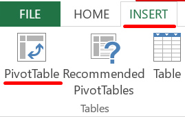
This action will prompt another window, which will show you some options about where you would like to place your pivot table.
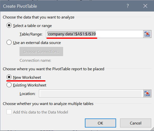
The first highlighted option refers to the range of the selected data you want to use for the pivot table. The second one asks you whether you would like to insert the pivot table in a new worksheet or in the existing one. For the purposes of tidy working, I recommend putting the pivot table in a new worksheet.
The result of this action will show you the following window in a new tab of the Excel file:
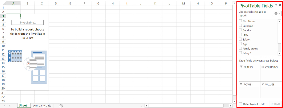
The block surrounded in red is the main menu with pivot functionalities. What options you select here will determine how your pivot table will eventually look.
Step 2: Set an intention
The main thing you should ask yourself before you begin making a pivot table is what the end result should look like. Since pivot tables have numerous options, it is important to have a clear concept of your goal, otherwise you might end up lost exploring everything you could do with a pivot table (which is a lot!).
In order to show you a couple of core functionalities in pivot tables, we will focus on the following three outputs:
- Create a summary for salaries across regions in the US
- Create a cross table between gender and occupation
- Create a visualization of the cross table from the previous step
Step 3: Create a summary
One of the best and handiest functions of pivot tables, as mentioned, is the creation of quick summaries. In this case, we would like to see whether there are any differences between employee salaries on a regional level.
There are 2 mains decisions you should make when creating your pivot table:
- What are the columns you will analyze?
- How are the selected columns to appear graphically?
In that field box you see on the left, there are two blocks with options. The one labeled “PivotTable Fields” represents the columns from your dataset:
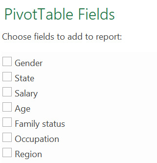
From this list you can pick which columns you need for your analysis. In our case, we need the column “Region” and the column “Salary”. You can click on them and see them appear in the second box with layout options, as well as in the left part of your workbook as a pivot table:
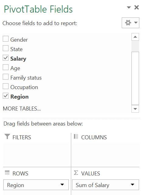
The second box under the columns selection stands for the second step of your pivot table design, namely, how the columns will appear. The process of this design is extremely easy, because you can simply drag the columns from the list above and drop them in the fields, depending on where you want them to appear. Let us look more closely at the options we’re given:
- Values: In this box, you add the columns that you would like to show as an output of the summary. For our example, this is the Salary column, because we’re interested in the salary figures per region.
- Filters: Here you can create a custom filter, which enables you to exclude some parts of your data and show only the items you find relevant for your analysis.
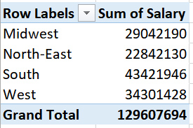
- Columns and Rows: Here you can drag the input columns depending on whether you want them to appear as columns or rows in the pivot table. Right now the “Columns” box is empty, because the “Region” column is in the “Rows” section. Here is an example of how the result would differ visually:
#### In Rows
#### In Columns

While the way you decide to distribute your analyzed columns is a matter of taste, there are certain conventions when it comes to readability. Having the “Region” column in the “Rows” box makes this particular table easier to comprehend. With that said, changing the design of your pivot table is so quick that you can experiment until you find the optimal way to present your data summary.
One more adjustment we could make to aid the comparison between regions is to change the format of the value shown in the pivot table. Right now, we have sums of all salaries per region. This is not a very handy metric in this case, so we would like to change this to an average of the salaries. This can easily be done by navigating to the right bottom panel of options (the layout options) and clicking on the small downward arrow on the “Salary” icon:
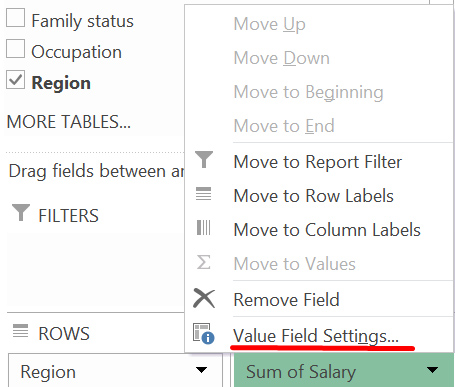
This will open a dropdown menu where you should select the last option—Value Field Settings. This will prompt a window, where all of the options for the format of the value are presented:
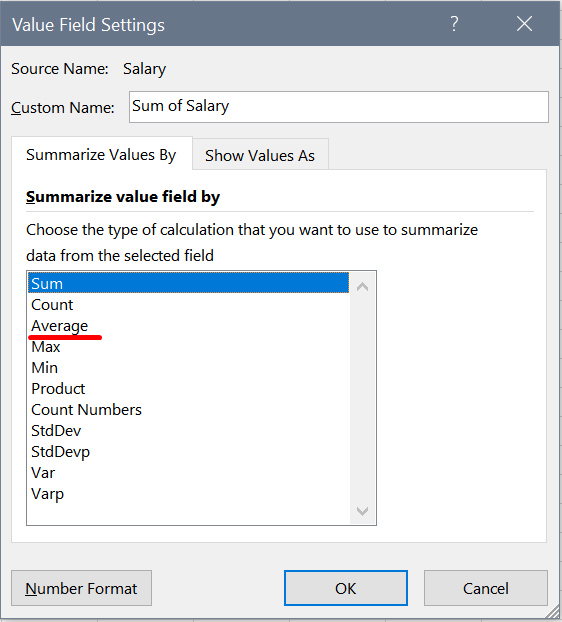
You can see here that the selected option now is Sum, which is why we see the sums of the salaries in the pivot table. If you change it to Average, this will immediately alter the output in the pivot table:
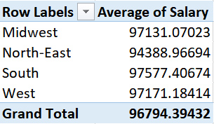
To wrap up, with just a few single drag ’n’ drops and clicks, you have created a table that contains valuable summary statistics!
Step 4: Create a cross table
A cross table is a table where you cross two columns with one another in order to see how the values of the first are distributed within the values of the second. For our example, we’ll create a cross table between gender and occupation. Simply put, we will explore how the different occupations in our tech company vary across the gender of the employees.
Since the “Occupation” column has more values than “Gender”, we will put it in Rows—this will make the pivot table more readable. We will then put Gender in the Columns section to achieve the aforementioned crossing. The “Options” field now looks like this:
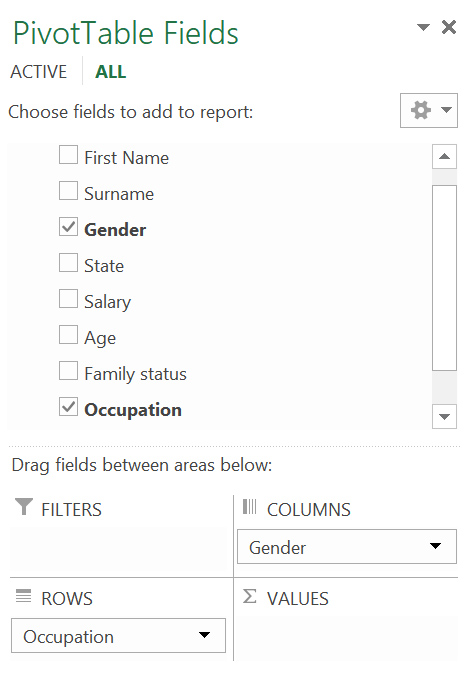
There is something missing here, though. Not having a column in “Values” will produce this table:
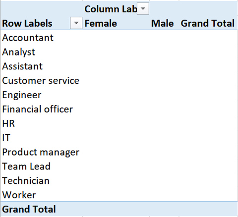
This output doesn’t tell us anything! In order to populate the table, we need to drag the “Gender” column into the “Values” box as well. Remember, the “Values” section contains the actual numbers that are to be shown in the pivot table. Here is how it looks after we have added “Gender” to “Values”:
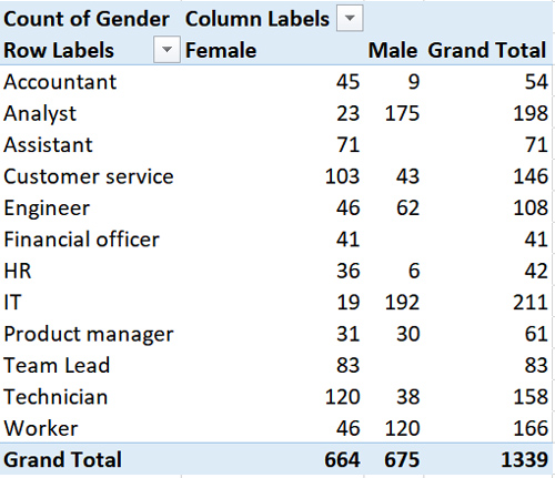
Now this output makes much more sense!
Step 5: Create a visualization of the cross table
Another major advantage of using pivot tables is the quick and easy visualization of results. The table we created above is indeed a useful summary, but when it comes to presenting results such as these to stakeholders, a good graph works miracles, since it’s much easier to comprehend.
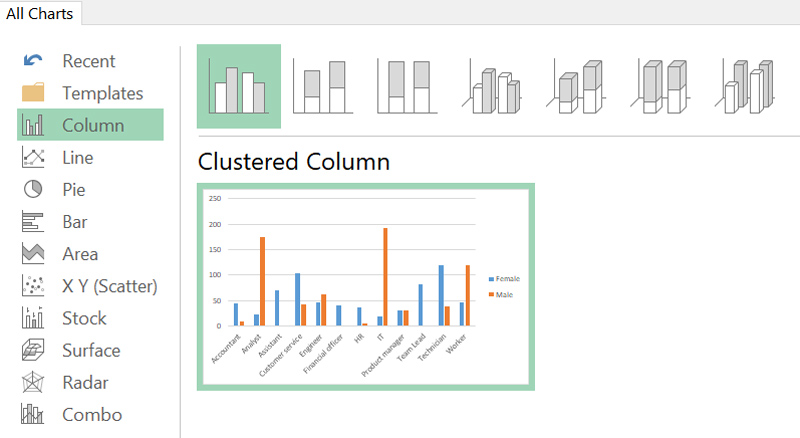
To show the difference between gender distribution based on professional occupation, we will create a bar chart. All you need to do is go to the “Insert” tab in the ribbon again and select “Recommended Charts” while you are in the worksheet where your pivot table is located.

Since you have already grouped the data into a pivot table, Excel starts making suggestions as to what chart will best suit your needs. As you’ll see, it automatically proposes a clustered column chart, which is exactly what we need:
Selecting the suggested option will yield this graph:
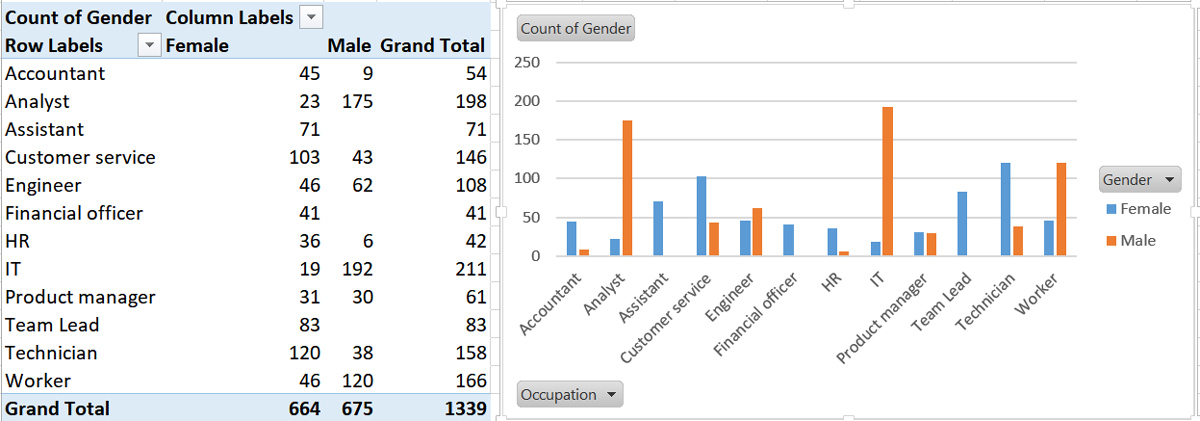
Compared to the table with its bland numbers, the chart gives a much more immediate overview of the breakdown of occupations we were looking for. Naturally, you can play around further with the way the chart looks to make it even more user-friendly!
5. Wrap-up
So there you have it: An easy, step-by-step guide on how to create a pivot table in Excel. In this post, we explored techniques and approaches to creating pivot tables when it comes to basic summaries. By now, you can hopefully see how mastering pivot tables will make your life as a data analyst considerably easier. Let’s finish with a summary of the most important steps in the process of creating a pivot table:
- Make sure your dataset is ready for analysis
- Have a plan—decide in advance what analysis you would like to conduct on your data
- Pick your input columns and put them in the right options boxes; don’t forget to add one of the columns to the “Values” box
- Decide on the most suitable summary statistics type—sum, count, average, etc.
- Experiment with switching rows and columns in order to get the most presentable output
- Support your summary with a quick and awesome visualization
There is a lot more to be said about the design and usage of pivot tables. In this post, we went through the most essential steps that will enable you to create meaningful summaries of your data without too much hassle.
Pivot tables are very versatile and thus, they can act as dynamic reports, where you can change the input columns on the go, without having to start from scratch every time. Paired with some graphs, data summaries become much more powerful and suitable to show to clients and stakeholders, which will increase the value of your services immensely.
Interested in learning more about how to use different Excel functions? Check out this video, featuring CareerFoundry’s very own in-house data scientist, Tom! He’ll show you 10 of the most-used Excel functions:
For a hands-on introduction to the field of data analytics, have a go at this free introductory data analytics short course. And, if you’d like to learn more about the techniques used by data analysts, check out the following:
