Conditional Formatting is one of the most requested features of Excel. It brings your attention to what matters on a spreadsheet, making your analysis and reports are more compelling.
With Conditional Formatting, data analysts can format cells or display icons depending on the cell value’s performance against a rule.
In this tutorial, you’ll learn how to apply Conditional Formatting rules to text and number values. I’ll also talk you through using the data bars and icon sets features of Conditional Formatting.
You can learn more Excel analysis skills with our free 5-day data short course.
Here’s what we’ll cover:
- Format based on the text value
- Conditional Formatting with number values
- Manage Conditional Formatting rules
- Using data bars to measure performance
- Conditional Formatting for KPI performance
Use this Excel workbook to practise.
1. Format based on the text value
For our first example of setting up a Conditional Formatting rule, we have a list of tasks and their current status. The status is either “Not Started,” “In Progress,” or “Complete.”
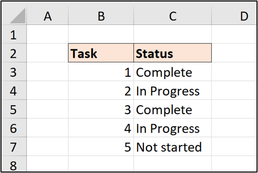
We would like to automatically format the cells when the task status is set to “Complete.”
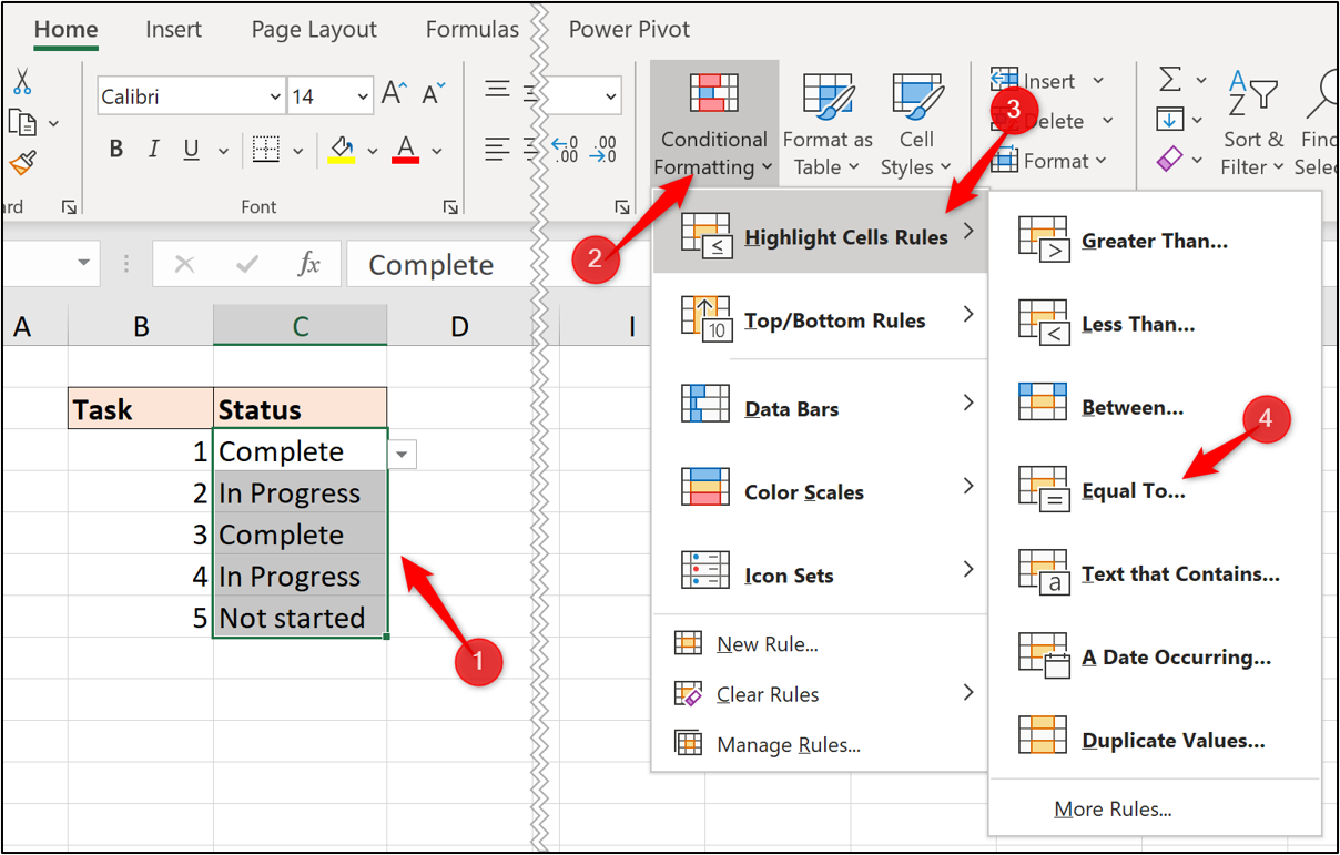
1. Select the range C3:C7.
2. Click Home > Conditional Formatting > Highlight Cells Rules > Equal To.
3. Enter “Complete” into the box provided and specify the format you want to apply. Click OK.
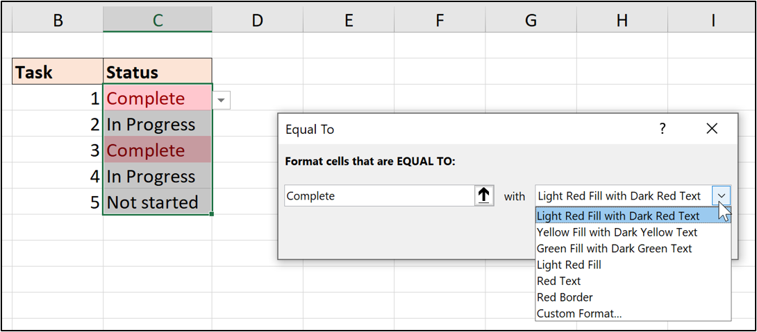
In this example, I have opted for a green fill color.
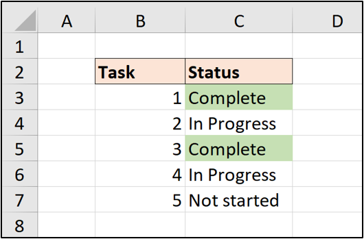
When a cell value is changed, the format is automatically applied or removed.
2. Conditional Formatting with number values
Let’s now look at an example of setting up Conditional Formatting rules for number values.
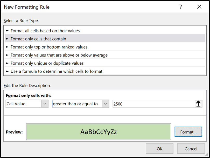
In this example, we have a list of product sales and we will create two rules. One rule to format values that are greater than or equal to 2500 in green, and a second rule to format values between 1500 and 2499 in orange.
1. Select the range C3:C8.
2. Click Home > Conditional Formatting > Highlight Cells Rules.
3. There is not an option for greater than or equal to, so click More Rules.
4. Select “greater than or equal to” from the list and enter 2500 for the value. Click Format and choose the format you want to apply.
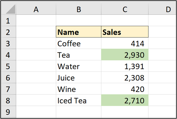
The first rule is applied. Two values meet this criteria and are formatted.
You can create and apply as many Conditional Formatting rules to a range as you need, although you probably do not want more than three or four.
5. Select range C3:C8, and click Home > Conditional Formatting > Highlight Cells Rules > Between.
6. Type 1500 in the first box, type 2499 in the second box, and then select the format you want to apply.
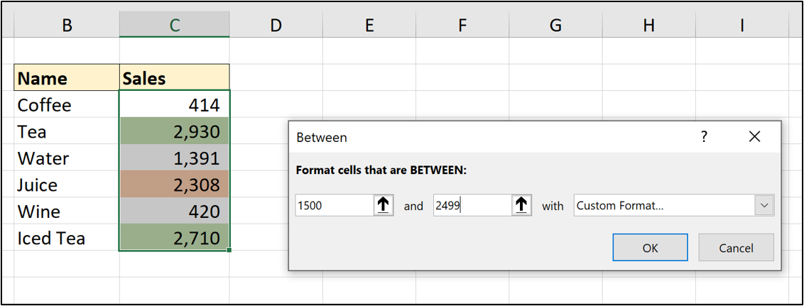
Both rules are now applied to the range.
3. Manage Conditional Formatting rules
Excel makes it very easy to find, edit and delete your existing Conditional Rules.
1. Click any cell within the formatted range.
2. Click Home > Conditional Formatting > Manage Rules.
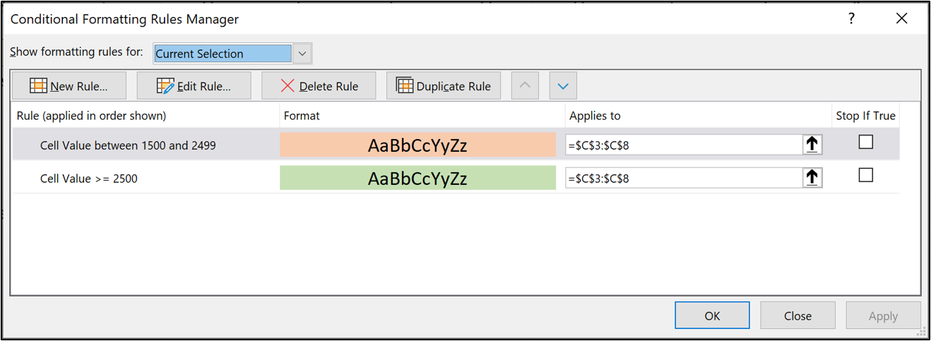
There is a lot of information and functionality in the Conditional Formatting Rules Manager window. Let’s explore the different elements of the window.
- The “Show formatting rules for” list defaults to “Current Selection.” We can see both rules because we clicked a cell within the formatted range.
This list can be changed to view all the rules for a specific sheet. This is very useful for finding the Conditional Formatting rules on a sheet.
- The rules are listed with columns showing the rule, format, and range that it applies to.
- There are buttons to create, edit, delete and duplicate rules.
- The two up/down arrows next to the buttons are used to change the order of the rules. If more than one rule is True, both formats are applied with the rule highest in the list applied last.
4. Using data bars to measure performance
Data bars are very useful for comparing values against each other and also measuring progress.
In this example, we have some sales values and want a visual indicator to their performance.
1. Select range C3:C8.
2. Click Home > Conditional Formatting > Data Bars.
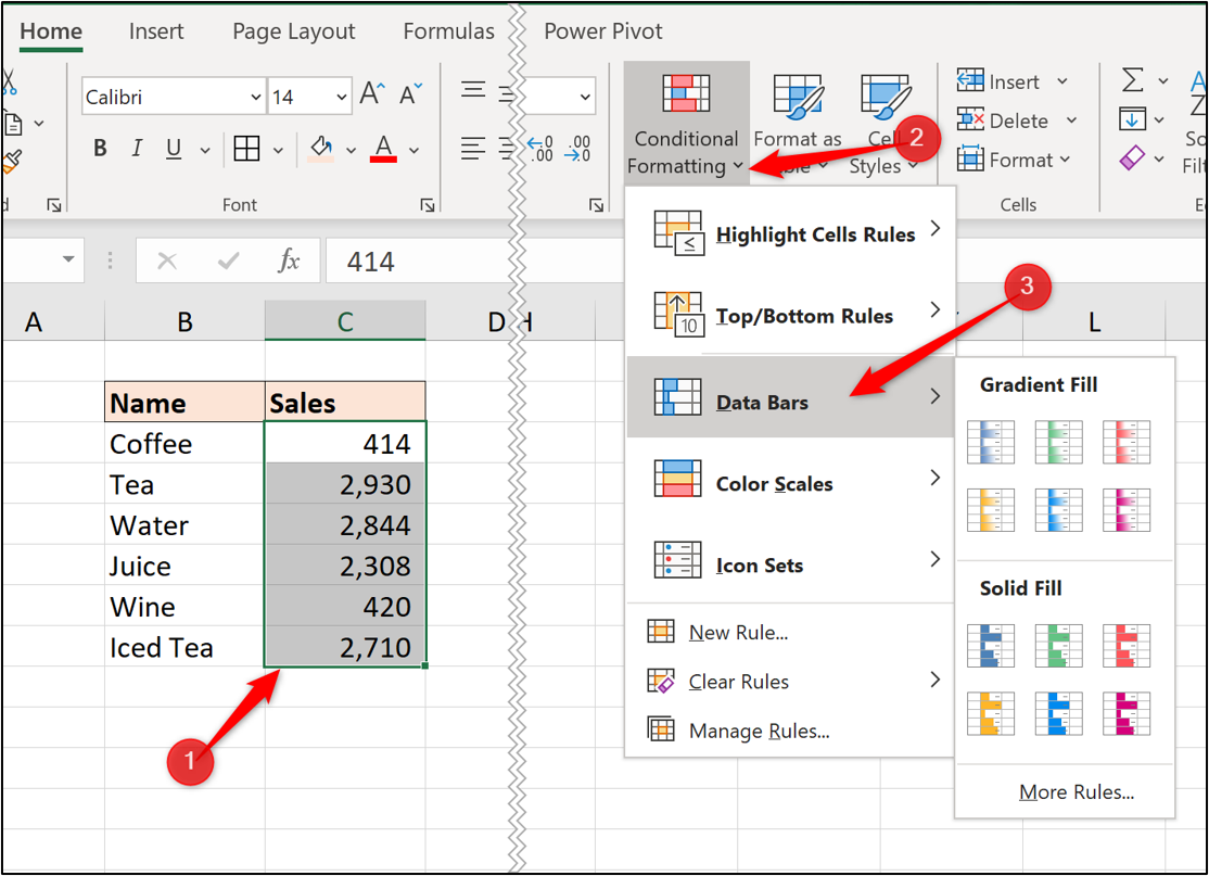
3. There is the selection from six different gradients and six different solid fill colors. Click More Rules to see more options.
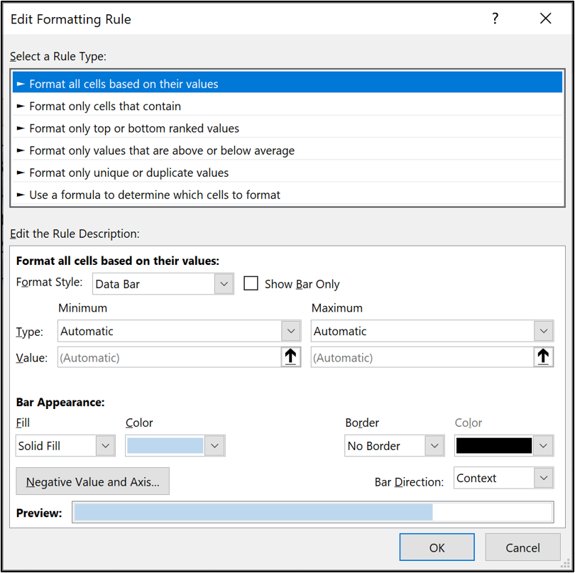
4. There are a few options in here to customize your data bar. I have opted for a lighter blue than the colors offered by default. This is because I want to see the number behind the color. Click Ok.
The data bar is applied to the selected range.
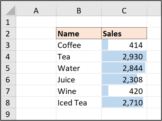
The bar covers the entire cell for the maximum value. This is how the automatic axis works that is applied by default.
You can edit this to specify custom minimum and maximum values for the bar axis.
5. Conditional Formatting for KPI performance
The icon sets feature of Conditional Formatting offers a variety of different icons such as up/down arrows, stars and traffic lights. These icons can be applied when a rule is met and offer a nice alternative font and cell formatting.
In this example, we will display an icon in cell B3 if the value is greater than or equal to 45%.
1. Select cell B3.
2. Click Home > Conditional Formatting > New Rule.
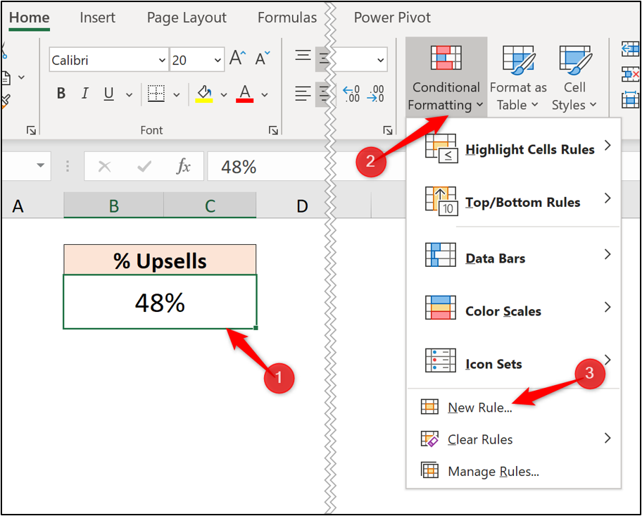
3. Click the “Format Style” list arrow and select Icon Sets.
4. Click the “Icon Style” list arrow and choose the icons you want to apply.
5. Change both “Type”options to Number, enter “0.45” for both values and change the second icon to No Cell Icon. Click Ok.
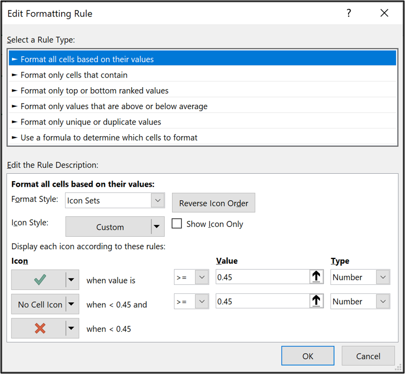
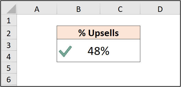
The rule is applied to the cell. A green tick mark is shown if the value is 45% or higher, otherwise the red cross is shown.
Final thoughts
I hope this has been a nice introduction to Conditional Formatting in Excel. There’s much more it can do, especially when you use formulas for the rule.
If you’re getting to grips with Excel in your quest to become a data analyst, you can try out CareerFoundry’s free data analytics short course, which is just a taster for their month-long Introduction to Data Analytics online course and full Data Analytics Program.
Keen to learn more Excel functions? Check out the following:
