Sure, data is essential for making the right business decisions, but the amount of it we have nowadays is astonishing.
Luckily, with the development of AI, we can delegate some of the boring tedious work and make the data analysis processes easier.
Whether it’s with augmented analytics or just through AI-boosted tools nowadays, embedding AI data into your workflow is a matter of business survival in competitive conditions. In this article, you’ll find out how data analysts can use AI to enhance their existing work routines, without any coding skills and rebuilding of systems.
Here’s what we’ll cover:
1. Ways to apply AI in data analytics
First, let’s review the main ways modern AI is used in data science and analytics.
AI analytics platforms
The first one is to use AI-powered analytics platforms. They have tons of functionality to help perform data analysis from start to finish. Those include Tableau, Microsoft Power BI, and RapidMinder for example.
AI tools
The second one is using AI tools meant for creating models and doing predictive analysis. This is quite an advanced topic, so if you’re interested in it it’s probably worth checking out our full guide to AI data analytics tools. Examples include:
Using LLMs for code generation
The third one is using Large Language Models like ChatGPT or Google’s Gemini to help you with generating code and finding the best ways to manipulate the data.
Which approach is best?
The first two approaches require adopting new technology, which is kind of a lot when you just want to boost your workflow. So, the third approach is the one people mostly end up taking in this type of situation.
It quickly provides you with results with little effort needed. However, the main problem with using LLMs is that to ask questions about the data, you need to first somehow familiarize the LLM with it. And since importing such data is not yet possible, it becomes tricky.
It turns out, however, that there are AI tools you can use in the same way as LLMs, but they’re made specifically for working with data, so it’s much more convenient.
These tools allow you to get quick answers with no coding knowledge needed, including asking questions in natural language. In this article, you’ll see a couple of such tools and discover how to use them in combination with your regular reporting software.
2. AI data analytics workflow tools
As a reporting tool, I’ll be using Flexmonster Pivot & Charts, which is a pivot table component with charts for web reporting. It embeds into the web page and allows users to manipulate their data through the toolbar, so no coding on the user side is needed.
As for the AI tools, there’s Polymer, InsightBase, and AnswerRocket. The first two have a two-week free trial which was used to explore the functionality in this article, and for AnswerRocket you can request a custom demo.
As for the dataset, the exploration will be done on Forbes Billionaire Evolution (1997—2023). It’s not your common business data, but it’ll be interesting to dig into.
Flexmonster
As a starting point, the Flexmonster component is already embedded into a simple web page. Since this article aims to be as code-free as possible, it’ll start with a clean grid, and all the steps of creating a report will be done only using the UI.
You can find a quick tutorial on how to embed the pivot table onto the webpage in Flexmonster documentation. It should look like this:

To add the dataset, navigate to the Connect tab, choose where you want to connect the file from and select the file itself.
If your dataset has many variables, don’t worry if it appears on the screen weirdly. This is because you haven’t specified the variable selection for rows and columns yet. For example, with this dataset, the following is displayed:
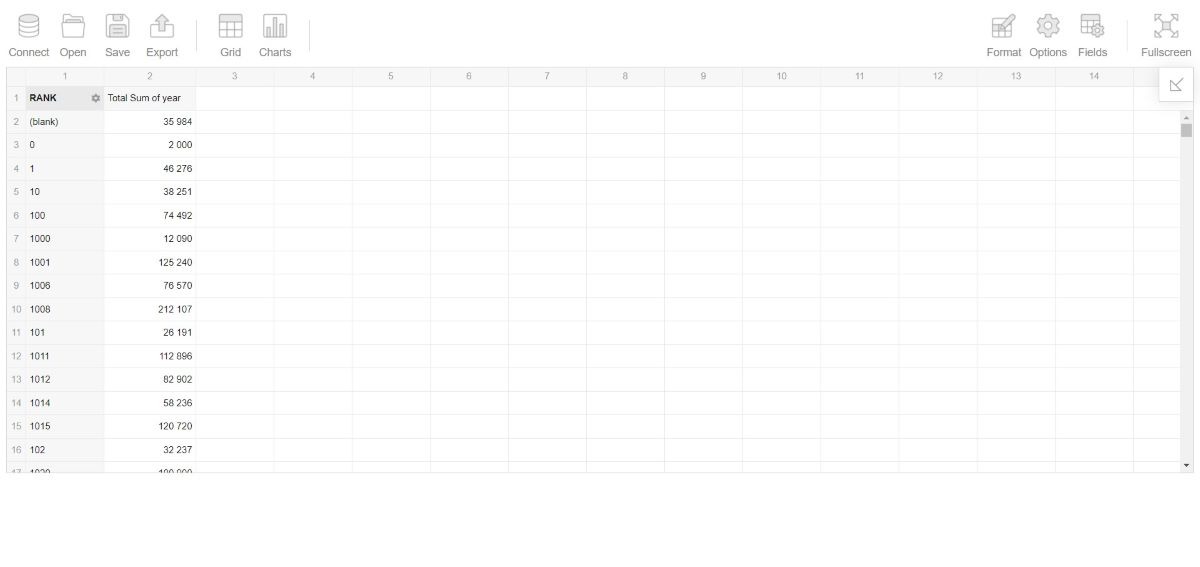
This is the part where you would normally just start selecting different fields to explore the dataset and see what it’s all about. But today let’s try to do the basic exploration using AI.
Polymer
The first AI tool to try out in this context is Polymer. Getting started with Polymer is very simple—just load your dataset from a device or cloud. After doing that, you’ll see three tabs: insights, data, and boards. In the “Data” tab you can browse your dataset.
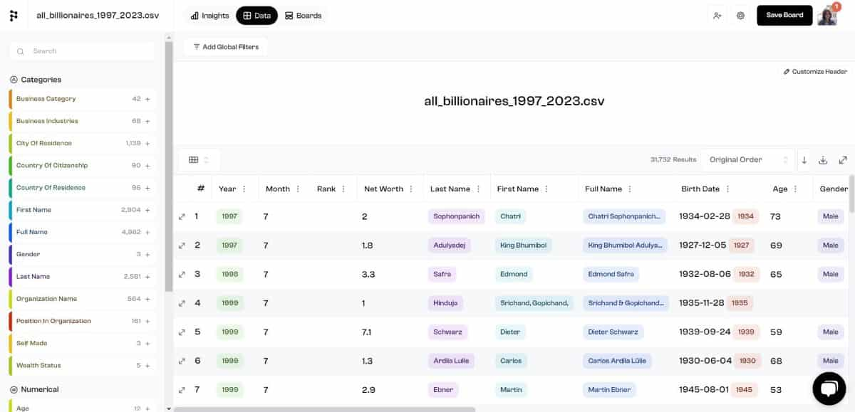
The “Boards” is where all your dashboards will be stored, and the “Insights” is what we’re going to mainly focus on because that’s where you ask questions and explore.
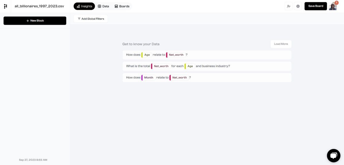
Here it offers a couple of pre-generated questions to explore the dataset, which you can update by clicking “Load More”. If you click on it, it will generate a visualization as the answer to that question. For example, here’s the result for “How does Age relate to Net Worth?”:
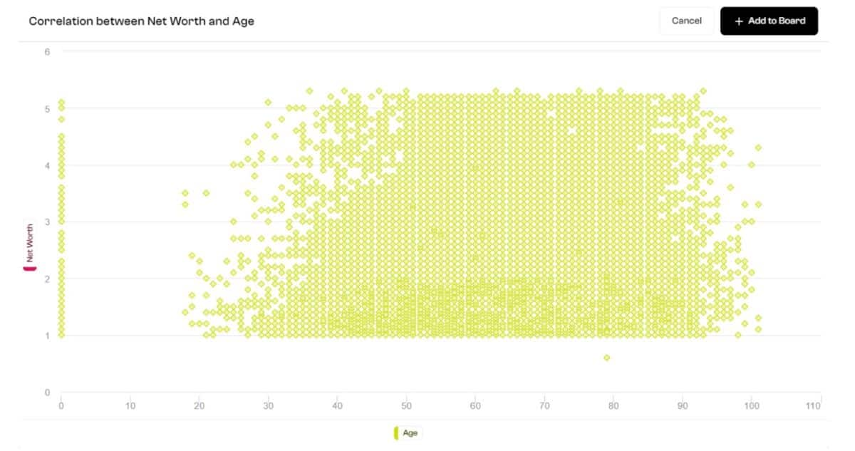
These questions can help you get a basic understanding of the dataset and might give you some ideas for further exploration. For example, if you wanted to look deeper into this correlation between age and net worth, here’s what you do…
Using the Flexmonster tool, switch from pivot to charts and select the “age” field for rows, and different aggregated values of the “net_worth” field for values. Here’s the sum, average, and count, for example:
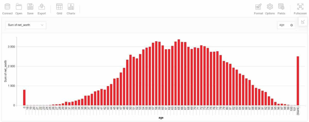
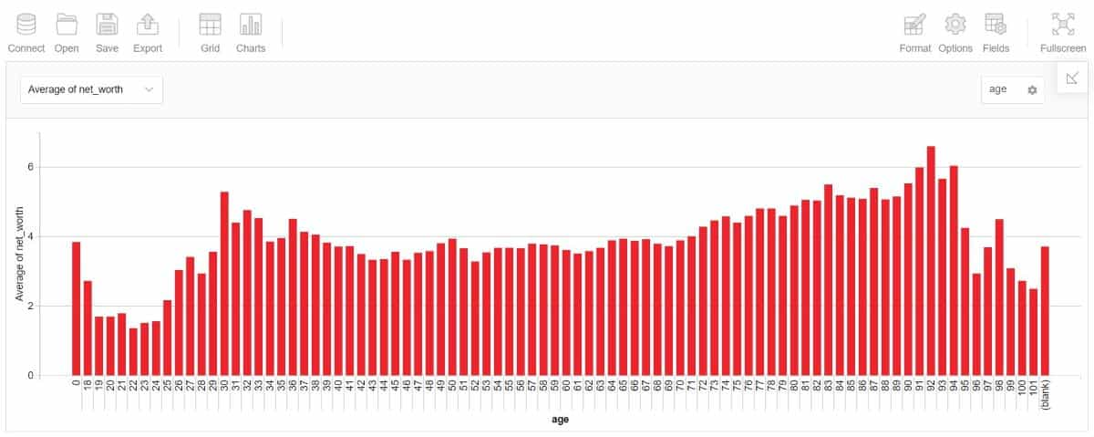
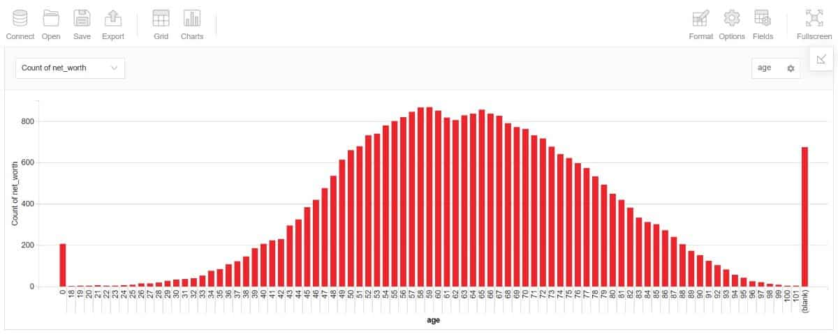
Now you have more understanding of the correlation between age and net worth than with just the Polymer’s visualization, but it still holds the credit for the initial thought to explore it deeper.
In Polymer, you can also manually create visualizations and other widgets for dashboards, but it’s not that different from exploring the dataset with non-AI tools. But what is different is that in the “Boards” tab you can find an AI-generated board for your dataset.
In this case, it had four heatmaps, two scorecards, and a column chart. I wouldn’t say that the visualizations are always on point, but you can still take them as inspiration for further analysis.
InsightBase
InsightBase has a bit less functionality than Polymer in the sense that it doesn’t allow you to scroll through the dataset or manually create visualizations from queries. But what’s interesting about it is that it allows you to ask any questions about the data in natural language, not just use the pre-generated ones.
To get started with InsightBase, you need to create a data source from your database through the “Data Sources” tab, and then create a project using that data source. Then you can start asking questions and save them to dashboards as widgets.
To ask a question you either choose one of the suggested ones or type in your own. Depending on the question, the answer might be just a number, some text, or a visualization. Here, for example, the question was about the total number of billionaires, and the answer, represented as a number, can be saved as a widget on any dashboard.
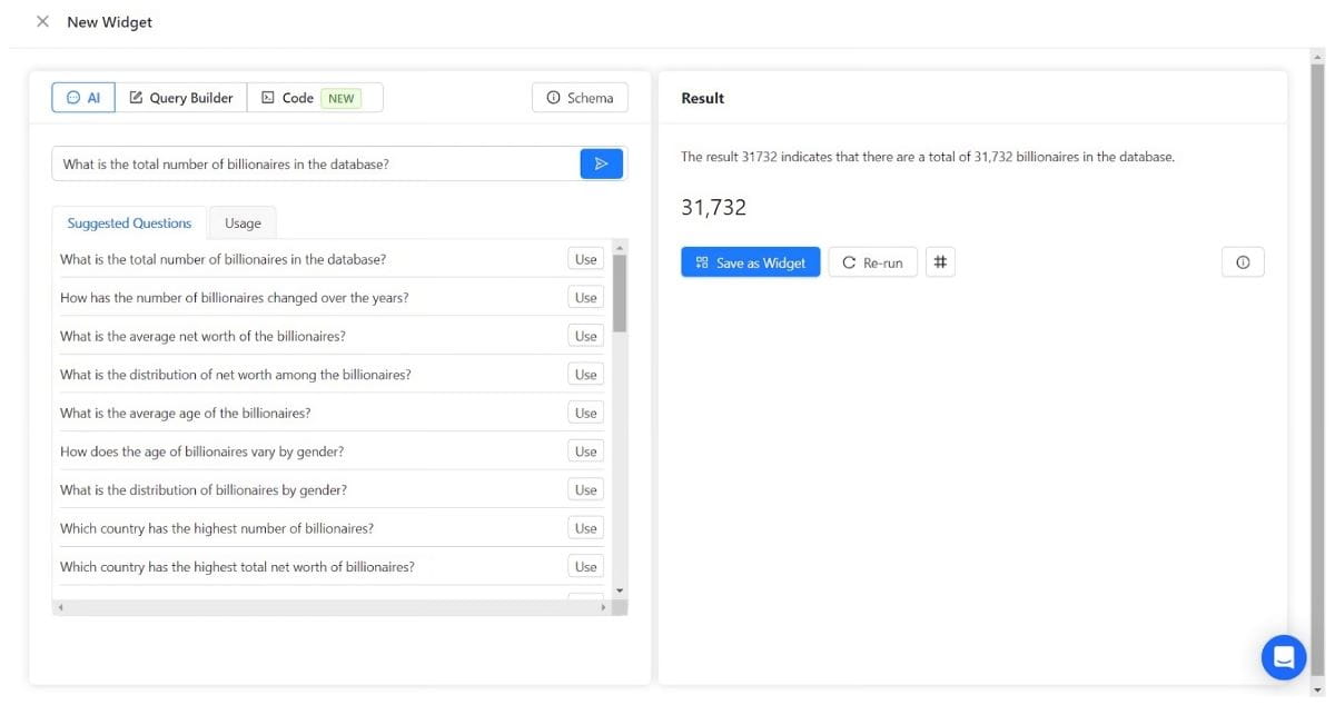
Coming up with the right questions for the dataset might sometimes be difficult, so let’s see a particular example of how and when this feature comes in handy.
Let’s say you want to analyze different annual stats for net worth through Flexmonster’s pivot table. Just outputting the selected measures gives the following result:
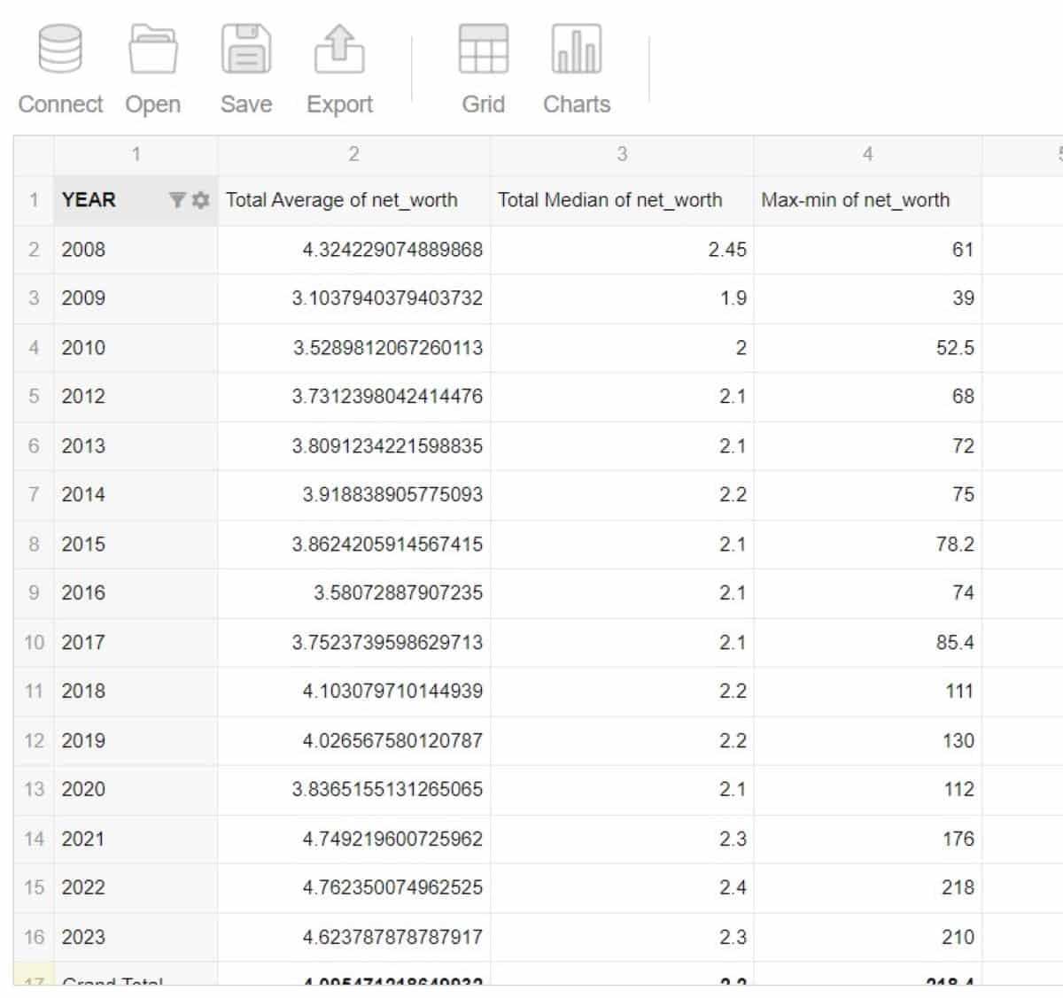
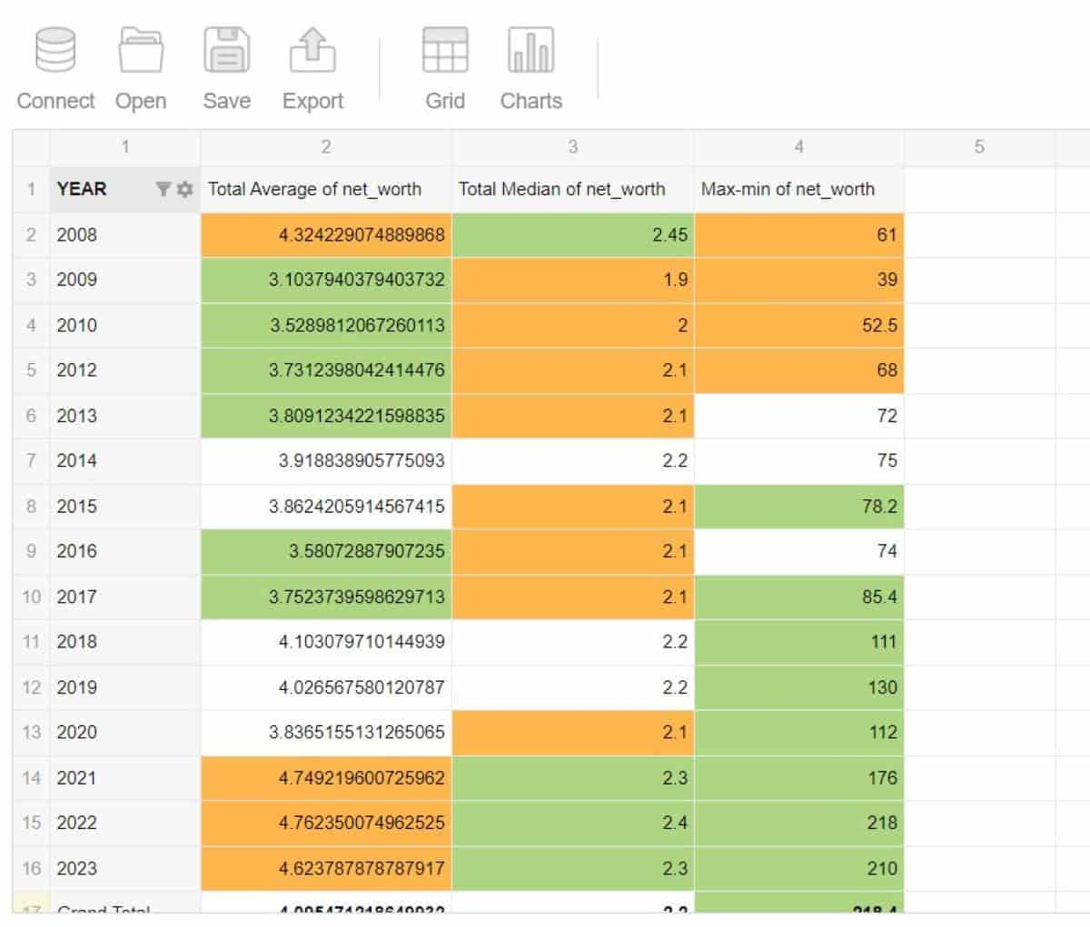
It’s quite informative but might appear a bit too bland and monotone for effective analysis. So, let’s apply some conditional formatting: green for values greater than average, orange for lower than average, and leave values that are roughly equal to the average white.
But wait, how do you know the average? That’s something to ask InsightBase. The result is the following:
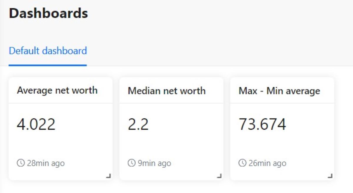
Now apply the conditional formatting via Format > Conditional Formatting:
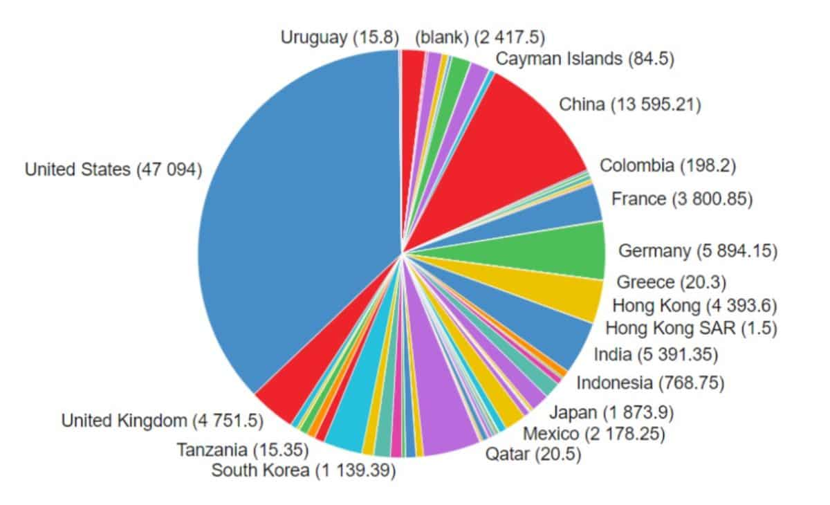
InsightBase can also help you with visualizations. For example, if you want to know the distribution of billionaires by country it would be easier to ask one question than to configure the chart manually:
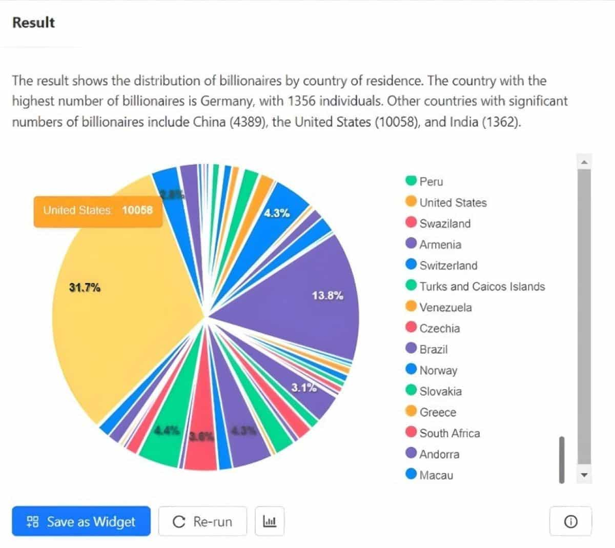
They’re also interactive so you can hover over a particular part of visualization to see, in this case, for example, what country it represents.
For comparison, here is the same chart but configured manually using Flexmonster:
3. Bottom line
As AI tools are developing and progressing, we can use them to our advantage in lots of different ways. Not just as something completely new, but also to improve your existing work routine to make it more time- and resource-efficient.
So, don’t be shy to think out of the box and use the existing tools in maybe sometimes unconventional, but beneficial ways.
To get started with some practical work in data analytics, try out CareerFoundry’s free 5-day data analytics course, or better still, talk to one of our program advisors to see how a career in data could be for you.
Otherwise, you can read these articles:
